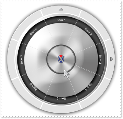
The RadialMenu object supports the following properties and methods:

The RadialMenu object supports the following properties and methods:


| Name | Description | |||
| AllowBrowseItem | Specifies that the a new item gets browsed once the user clicks item. | |||
| AllowHotPointer | Indicates whether the pointer is oriented to the item, while hovering the radial menu. | |||
| AllowMoveOnFloat | Allows moving the control to a new position, when the user clicks and drags it over the screen, while it is floating ( Float property is set to a non-zero value ). | |||
| AllowToggleExpand | Specifies whether the radial menu can be shown in collapsed state. | |||
| AnchorFromPoint | Retrieves the identifier of the anchor from point. | |||
| Appearance | Retrieves or sets the control's appearance. | |||
| ArrowImage | Specifies the graphics ( image, icon, picture ) to be shown on the sub-items zone, for items that contains child items or sub items. | |||
| AttachTemplate | Attaches a script to the current object, including the events, from a string, file, a safe array of bytes. | |||
| BackColor | Specifies the control's background color. | |||
| Background | Returns or sets a value that indicates the background color for parts in the control. | |||
| BackgroundPicture | Indicates the picture to be shown on the radial menu's background. | |||
| BeginUpdate | Maintains performance when items are added to the control one at a time. This method prevents the control from painting until the EndUpdate method is called. | |||
| BrowseItem | Specifies the item being browsed. | |||
| Caption | Specifies the caption on the control. | |||
| CustomBackAlpha | Specifies the value of alpha / opacity channel to show the custom portion of the radial menu. | |||
| CustomBackColor | Specifies the color to show the custom portion of the radial menu. | |||
| CustomHeight | Gets a value that represents the height of the inner custom control. | |||
| CustomLeft | Gets a value that represents the distance between the left side of the inner custom control and the left side of the control itself. | |||
| CustomPicture | Indicates the picture to be shown on the custom's background. | |||
| CustomTop | Gets a value that represents the distance between the left side of the inner custom control and the left side of the control itself. | |||
| CustomWidth | Gets a value that represents the width of the inner custom control. | |||
| DisplayAngle | Specifies the angle to display the items around the radial menu. | |||
| DisplayArrow | Indicates where the arrow of items with children is displayed. | |||
| DisplayCenter | Specifies the ratio to determine where the image/caption of the item is displayed. | |||
| DisplayCenterArrow | Specifies the ratio to determine where the arrow of items with children is displayed. | |||
| DisplayRadial | Determines how the item is displayed on the radial menu. | |||
| Enabled | Enables or disables the control. | |||
| EndUpdate | Resumes painting the control after painting is suspended by the BeginUpdate method. | |||
| EventParam | Retrieves or sets a value that indicates the current's event parameter. | |||
| ExcludeParentFromItems | Gets or sets a value that specifies whether the parent portion of the control is excluded from the items zone. | |||
| ExecuteTemplate | Executes a template and returns the result. | |||
| Expanded | Indicates whether the radial menu is expanded or collapsed. | |||
| ExtraCaption | Specifies any extra caption on the control. | |||
| Float | Specifies whether the control is shown as float. | |||
| Font | Retrieves or sets the control's font. | |||
| ForeColor | Specifies the control's foreground color. | |||
| FormatABC | Formats the A,B,C values based on the giving expression and returns the result. | |||
| FormatAnchor | Specifies the visual effect for anchor elements in HTML captions. | |||
| GoBack | Advances to the parent item. | |||
| HTMLPicture | Adds or replaces a picture in HTML captions. | |||
| hWnd | Retrieves the control's window handle. | |||
| Images | Sets at runtime the control's image list. The Handle should be a handle to an Images List Control. | |||
| ImageSize | Retrieves or sets the size of icons the control displays.. | |||
| IndexFromPoint | Retrieves the index of the radial pie, from the point. | |||
| InflateCustom | Inflates or deflates the client area of the custom portion of the control. | |||
| InflateItems | Inflates or deflates the client area of the items portion of the control. | |||
| InflateParentPicture | Inflates or deflates the client area to display the picture on the background of the parent's zone of the control. | |||
| InflateRadialMenu | Inflates or deflates the client area of the radial menu control. | |||
| ItemFromPoint | Retrieves the item, from the point. | |||
| Items | Retrieves the control's Items collection. | |||
| ItemsBackAlpha | Specifies the value of alpha / opacity channel to show the items portion of the radial menu. | |||
| ItemsBackColor | Specifies the color to show the items portion of the radial menu. | |||
| ItemsImageHeight | Specifies the height to display the item's image. | |||
| ItemsImageWidth | Specifies the width to display the item's image. | |||
| ItemsPicture | Indicates the picture to be shown on the items's background. | |||
| LayerUpdate | Specifies where the control updates its content. | |||
| MinVisibleCount | Specifies the minimum number of items being visible on the radial menu. | |||
| ParentBackAlpha | Specifies the value of alpha / opacity channel to show the items portion of the radial menu. | |||
| ParentBackColor | Specifies the color to show the parent portion of the radial menu. | |||
| ParentCaption | Specifies the caption to be shown on the parent zone, based on the state of the radial menu. | |||
| ParentImage | Specifies the graphics ( image, icon, picture ) to be shown on the parent zone, based on the state of the radial menu. | |||
| ParentImageHeight | Specifies the height to display the parent image in specified state. | |||
| ParentImageWidth | Specifies the width to display the parent image in specified state. | |||
| ParentOnPoint | Indicates if the point hits the parent zone of the radial menu. | |||
| ParentPicture | Indicates the picture to be shown on the parent zone's background. | |||
| ParentSize | Specifies the size to display the parent zone. | |||
| PicturesPath | Specifies the path to load the pictures from. | |||
| PointerAngle | Specifies the angle of the pointer to target another item or index. | |||
| PointerIndex | Specifies the index within the radial menu to target the pointer. | |||
| PointerPicture | Indicates the picture to be shown on the pointer zone's background. | |||
| PointerPictureHeight | Specifies the height of the the pointer, relative to the center of the radial menu. | |||
| PointerPictureWidth | Specifies the width of the the pointer, relative to the center of the radial menu. | |||
| PointerPictureX | Specifies the x-coordinate of the the pointer, relative to the center of the radial menu. | |||
| PointerPictureY | Specifies the y-coordinate of the the pointer, relative to the center of the radial menu. | |||
| RadialLineAlpha | Specifies the value of alpha / opacity channel to show the giving line within the radial menu. | |||
| RadialLineColor | Specifies the color to show the given radial line within the control. | |||
| RadialLineSize | Specifies the size to show the giving line within the radial menu. | |||
| RadialLineStyle | Specifies the style to show the given radial line within the control. | |||
| Refresh | Refreses the control. | |||
| ReplaceIcon | Adds a new icon, replaces an icon or clears the control's image list. | |||
| Root | Retrieves the root item. | |||
| SelBackAlpha | Specifies the value of alpha / opacity channel to show the selection of the radial menu. | |||
| SelBackColor | Specifies the selection background color. | |||
| SelectedIndex | Gets or sets a value that indicates index to be selected. | |||
| SelForeColor | Specifies the selection foreground color. | |||
| ShadowColor | Specifies the control's shadow color. | |||
| ShowImageList | Specifies whether the control's image list window is visible or hidden. | |||
| ShowToolTip | Shows the specified tooltip at given position. | |||
| State | Specifies the state of the radial menu. | |||
| SubItemsBackAlpha | Specifies the value of alpha / opacity channel to show the sub items zone of the radial menu. | |||
| SubItemsBackColor | Specifies the color to show the sub items zone of the radial menu. | |||
| SubItemsSize | Specifies the size to display the sub-items zone. | |||
| Template | Specifies the control's template. | |||
| TemplateDef | Defines inside variables for the next Template/ExecuteTemplate call. | |||
| TemplatePut | Defines inside variables for the next Template/ExecuteTemplate call. | |||
| ToolTipDelay | Specifies the time in ms that passes before the ToolTip appears. | |||
| ToolTipFont | Retrieves or sets the tooltip's font. | |||
| ToolTipPopDelay | Specifies the period in ms of time the ToolTip remains visible if the mouse pointer is stationary within a control. | |||
| ToolTipWidth | Specifies a value that indicates the width of the tooltip window, in pixels. | |||
| ToString | Loads or saves the Items collection using string representation. | |||
| ToTemplate | Generates the control's template. | |||
| Version | Retrieves the control's version. | |||
| VisualAppearance | Retrieves the control's appearance. |