This article shows how you can start using any of our /JS components. All of our /JS components are HTML5 standalone-components, written from scratch in pure JavaScript, that require no dependencies to any third-party libraries. In order to use any of our /JS components you must first download and unzip the eXSuite/JS package here.
This article presents tutorials for (using the /JS component on .HTM files):
- requirements (indicates the library files you must include)
- handling keys (Shortcuts class)
- handling events (Listeners class)
- resizing the component
This article presents tutorials for (using the /JS component within Angular application):
- requirements (indicates the library files you must import)
- handling keys (Shortcuts)
- handling events (Listeners)
- resizing the component
Each /JS component installs the init.htm file that provides minimal code to show the component within a WEB page. For instance, the exgantt/js's init.htm file may show as follows:
      <html>


        <head>


          <script type="text/javascript" src="../exontrol.common.min.js"></script>


          <script type="text/javascript" src="../exontrol.patch.min.js"></script>


          <script type="text/javascript" src="../exmenu/exontrol.menu.min.js"></script>


          <script type="text/javascript" src="../exmenu/exontrol.menu.def.js"></script>


          <script type="text/javascript" src="../extree/exontrol.tree.min.js"></script>


          <script type="text/javascript" src="../extree/exontrol.tree.def.js"></script>


          <script type="text/javascript" src="exontrol.gantt.min.js"></script>


          <script type="text/javascript" src="exontrol.gantt.def.js"></script>


        </head>


        <body>


          <canvas id="cvsGantt" width="1024" height="640">


          </canvas>


          <script>


            var oGantt = new exontrol.Gantt( "cvsGantt",


            {


              data: "xml/datasource.xml", // loads the datasource.xml file


              chart:


              {


                paneWidthLeft: 0          // hides the control's left-pane (items)


              }


            });


          </script>


        </body>


      </html>
where:
- <head>
section includes the library files you must include in order to use the
component within your WEB page. The exontrol.common.min.js file includes common stuff
each /JS
component uses. The exontrol.patch.min.js file includes different fixes or
patches required by different browsers. The .def.js files are NOT required.
The .def.js files define default values (options, UI appearance) for different parts of the
component.
In order to use the exgantt/js component within your WEB page, the head section must include at least the following files:
<head><script type="text/javascript" src="../exontrol.common.min.js"></script><script type="text/javascript" src="../exontrol.patch.min.js"></script><script type="text/javascript" src="../exmenu/exontrol.menu.min.js"></script><script type="text/javascript" src="../extree/exontrol.tree.min.js"></script><script type="text/javascript" src="exontrol.gantt.min.js"></script></head>Also, you can include the .def.js files to provide your customization for the /JS components within your WEB page. The .def.js file must be declared after the base library, else it has no effect (include the <script type="text/javascript" src="exontrol.gantt.def.js"></script> declaration AFTER <script type="text/javascript" src="exontrol.gantt.min.js"></script>)
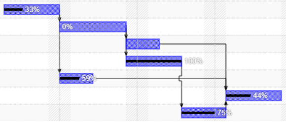
For instance, you can change the visual appearance of the Task bars the control shows from:
 to
to 
Open the exontrol.gantt.def.js file and replace the following sequence:
"Task":{shape:{frameColor: "rgb(0,0,255)",patternColor: "rgb(0,0,255)",pattern: 3 /*exontrol.PatternEnum.exPatternShadow*/}}"Task":{shape:{frameColor: "black",fillColor: "rgba(0,128,255,0.5)",patternColor: "rgb(0,128,255)",primitive: "RoundRect"}} -
<canvas> element defines the portion of HTML page where the /JS component is shown.
The <canvas> element is used to draw graphics on a WEB page. Always specify an id attribute (to be referred to in a script), and a width and height attribute to define the size of the
<canvas> element. To add a border, use the style attribute.
You should include the tabIndex attribute if you need keyboard support for the
component. In conclusion, your WEB page must include a <canvas> element as:
<canvas id="cvsGantt" width="1024" height="640" tabIndex="0"></canvas>
-
<script> section defines the association
between the <canvas> and the /JS component using a code
like follows:
<script>var oGantt = new exontrol.Gantt( "cvsGantt",{data: "xml/datasource.xml", // loads the datasource.xml filechart:{paneWidthLeft: 0 // hides the control's left-pane (items)}});</script>
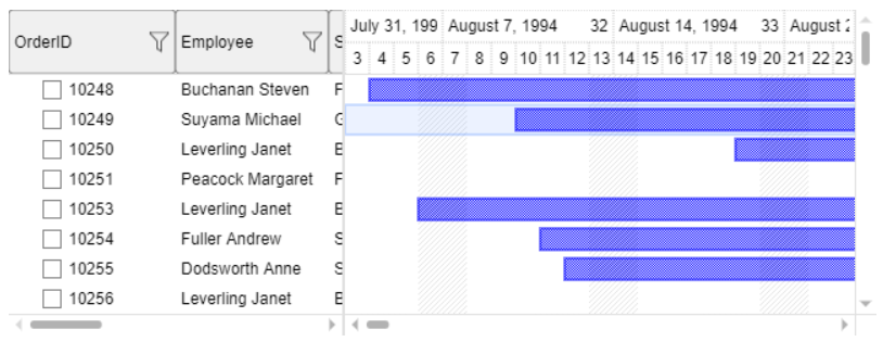
The code creates an exontrol.Gantt object and associates with the <canvas> element of id "cvsGantt". Once the association is done, the <canvas> element should draw the /JS component as shown:
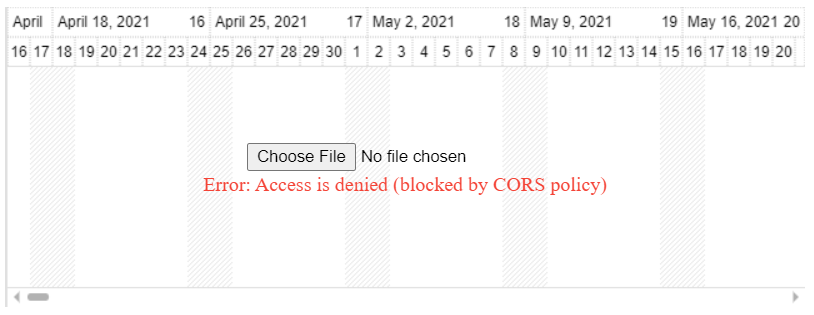
In case the control displays: "Error: Access is denied (blocked by CORS policy)", select the datasource.xml file from the xml folder or drag and drop it and you should get:

Once you managed to associate the <canvas> element with the exontrol.Gantt object (oGantt), you are ready to code the /JS component.
For instance, let's say we need to remove the control's selection (bars, links or items) once the user presses the Delete key. In order to provide keyboard support for the component, the <canvas> element you must include the tabIndex attribute, as <canvas id="cvsGantt" width="1024" height="640" tabIndex="0">.
The following equivalent samples bind the Delete key to call RemoveSelection(): if bars are present, it calls the chart's method; otherwise, it calls the control's method, which removes selected bars if any, or selected items:
      <script>


        oGantt.on("{Delete}",function(oShortcut)


        {


          oGantt.Chart.RemoveSelection() || oGantt.RemoveSelection();


        })


      </script>
or equivalent:
      <script>


        oGantt.Shortcuts.Add("Delete",function(oShortcut)


        {


          oGantt.Chart.RemoveSelection() || oGantt.RemoveSelection();


        })


      </script>
where oGantt is an object of exontrol.Gantt type. The Shortcuts member is supported by all of our /JS components.
The following sample displays the shortcuts the control currently supports:
      <script>


        oGantt.Shortcuts.forEach(function(oShortcut)


        {


          console.log(oShortcut);


        })


      </script>
where oGantt is an object of exontrol.Gantt type. Run the script and the output displays the following:
{shortcut: 'CTRL+SHIFT', description: 'toggles the type of exchange-windows', callback: f1(), thisArg: CW, keyState: 0}
{shortcut: 'CTRL+Z', description: 'undos the last exchange-window operation.', callback: f2(), thisArg: CW, keyState: -1}
{shortcut: 'CTRL+Y', description: 'redos the last exchange-window operation.', callback: f3(), thisArg: CW, keyState: -1}
{shortcut: 'ALT+ArrowDown', description: 'focuses the filter-prompt', callback: f4(), thisArg: Gantt, keyState: -1}
{shortcut: 'ALT+ArrowUp', description: 'focuses the filter-prompt', callback: f5(), thisArg: Gantt, keyState: -1}
The help folder includes the documentation for the /JS component.
- oEvent {null}, indicates that the control has no selected items
- oEvent {Item}, indicates an object of Item type that defines the control's single-item selected
- oEvent {array}, specifies an array of [Item] type that holds all selected items within the control
The following snippet of code shows you how to get list all the events the /JS component currently supports:
      <script>


        oGantt.Listeners.forEach(function(name)


        {


          console.log(name);


        })


      </script>
where oGantt is an object of exontrol.Gantt type. The Listeners member is supported by all of our /JS components. Run the script and the output displays the following:
onselchange
onclick
onchange
onsort
onfilter
onload
onerror
onscroll
onadditem
onaddgroupitem
onremoveitem
onaddcolumn
onremovecolumn
ondatechange
onchartselchange
ondateselchange
oncreatebar
onbarresize
onbarparentchange
onallowlink
oncreatelink
which specifies the list of the events the /JS component currently supports.
The following snippet of code shows you how to add a handler for each event the control provides:
      <script>


        oGantt.Listeners.forEach(function(name)


        {


          oGantt.Listeners.Add(name, function(oEvent)


          {


            console.log(name, oEvent);


          })


        })


      </script>
and the output shows as:
ondateselchange (1) [{...}]
onclick {dblClick: false, button: 1, modifiers: 0, view: t, level: i, ...}
onbarresize {item: h, key: '', bar: s}
onchange {object: s, action: 'chart-object'}
ondatechange t {oT: t, oLts: exontrol.Lts, lI: 2, lsX: 1, oLvs: e, ...}
ondatechange t {oT: t, oLts: exontrol.Lts, lI: 2, lsX: 1, oLvs: e, ...}
The following sample shows how you can add a handler for onselchange event only:
      <script>


        oGantt.on("selchange", function(oEvent)


        {


          console.log(oEvent)


        })


      </script>
or equivalent:
      <script>


        oGantt.Listeners.Add("onselchange", function(oEvent)


        {


          console.log(oEvent)


        })


      </script>
The HTMLCanvasElement.width property is a positive integer reflecting the width HTML attribute of the <canvas> element interpreted in CSS pixels.
The following sample uses the exontrol.CC.Resize(canvas) method to update the inside controls:
      <script>


        window.onresize = function()


        {


          cvsGantt.width = window.innerWidth - 20;


          cvsGantt.height = window.innerHeight - 20;


          exontrol.CC.Resize(cvsGantt);


        }


      </script>
The next sample is equivalent with the sample above, but uses the oCW.Resize(width,height) method:
      <script>


        window.onresize = function()


        {


          oGantt.oCW.Resize(window.innerWidth -
      20,window.innerHeight -
      20);


        }


      </script>
where the cvsGantt is an object of HTMLCanvasElement type (automatically generated by <canvas id="cvsGantt"> sequence), oGantt is an object of exontrol.Gantt type.
Each /JS component installs the angular-cli.app folder that includes all required library files and the source code to run the /JS component on Angular application.
The angular-cli.app folder includes all files (prefixed by exontrol.) you require to import within your application. For instance, the exgant/js component requires the following library files (in their import order):
- exontrol.common.min.js (includes common stuff each /JS component uses)
- exontrol.patch.min.js (includes different fixes or patches required by different browsers)
- exontrol.menu.min.js (exports the exontrol.Menu class, required only if you need contextual menu within the tree or gantt)
- exontrol.tree.min.js (exports the exontrol.Tree class)
- exontrol.gantt.min.js (exports the exontrol.Gantt class)
The .def.js files are NOT required to be imported. The .def.js files define default values (options, UI appearance) for different parts of the component. The .def.js file must be imported after the base library, else it has no effect. You can import the following .def.js files:
- exontrol.menu.def.js (defines default values, options, UI appearance for the exontrol.Menu class)
- exontrol.tree.def.js (defines default value, options, UI appearance for the exontrol.Tree class)
- exontrol.gantt.def.js (defines default value, options, UI appearance for the exontrol.Gantt class)
The following steps show how you can use the angular-cli.app folder:
- create a new Angular application using "ng new exsample" command (run the Visual Studio Code, open the terminal\PowerShell and run "ng new exsample" command)
- replace the content of the <angular-path-app>\src\app folder with
the content of the <exontrol-path>\exgantt\angular-cli.app folder
by doing any of these:
using symbolic link
- rename the src\app folder to src\app.copy (open the Windows Explorer, locate the <angular-path-app>src\app folder and rename it)
- create a symbolic link src\app to exgantt\angular-cli.app folder
(open the command prompt as administrator, run the mklink /D
<angular-path-app>\src\app <exontrol-path>\exgantt\angular-cli.app
so symbolic link created for <angular-path-app>\src\app
<<===>> <exontrol-path>\exgantt\angular-cli.app )

replacing the folder's content
- copy all files from exgantt\angular-cli.app folder to src\app folder (open the command prompt, run the copy /Y <exontrol-path>\exgantt\angular-cli.app\* <angular-path-app>\src\app)
- run the Angular application (run the Visual Studio Code, open the
<angular-path-app> folder, open the terminal\PowerShell and run "ng
serve -o --port 1234"). If everything is ok, the Chrome browser starts
and the Angular application runs on localhost.

where <angular-path-app> is the path where the Angular application has been created, <exontrol-path> is the path where the eXSuite/JS packaged has been unpacked.
The app.component.html file of angular-cli.app folder shows as:
      <canvas id="cvsGantt" width="1024" height="640" tabindex="0">


      </canvas>
where <canvas> element defines the portion of HTML page where the /JS component is shown. The <canvas> element is used to draw graphics on a WEB page. Always specify an id attribute (to be referred to in a script), and a width and height attribute to define the size of the <canvas> element. To add a border, use the style attribute. You should include the tabIndex attribute if you need keyboard support for the component.
The app.component.ts file of angular-cli.app folder shows as:
    import { Component } from '@angular/core';


    var exontrol = require("app/exontrol.common.min.js");


                   require("app/exontrol.patch.min.js");


    Object.assign(exontrol, require("app/exontrol.menu.min.js")); // adds Menu prototype to exontrol object, defines the exontrol.Menu class


                   require("app/exontrol.menu.def.js");


    Object.assign(exontrol, require("app/exontrol.tree.min.js")); // adds Tree prototype to exontrol object, defines the exontrol.Tree class


                   require("app/exontrol.tree.def.js");


    Object.assign(exontrol, require("app/exontrol.gantt.min.js")); // adds Gantt prototype to exontrol object, defines the exontrol.Gantt class


                   require("app/exontrol.gantt.def.js");


    @Component({


      selector: 'app-root',


      templateUrl: './app.component.html',


      styleUrls: ['./app.component.css']


    })


    export class AppComponent
    {


      constructor() {


        window.onload = function () {


          var oGantt = new exontrol.Gantt("cvsGantt",


          {


              data: "app/percent.xml"


          });


        }


      }


    }
- each require("...") call indicates the library file you need to import into your Angular application
- the oGantt = new exontrol.Gantt("cvsGantt") associates the "cvsGantt" (already defined in the app.component.html file ) with a new exontrol.Gantt object.
In conclusion, any /JS component you use requires a <canvas> element to run into, that can be:
- defined statically into app.component.html file
- created dynamically at runtime as in the following sample:
export class AppComponent {constructor() {var oCanvas = document.createElement("canvas");oCanvas.width = window.innerWidth-32;oCanvas.height = window.innerHeight-32;document.body.appendChild(oCanvas);var oGantt = new exontrol.Gantt(oCanvas,{data: "app/percent.xml"});}}
Once you managed to associate the <canvas> element with the exontrol.Gantt object (oGantt), you are ready to code the /JS component.
For instance, let's say we need to remove the control's selection (bars, links or items) once the user presses the Delete key. In order to provide keyboard support for the component, the <canvas> element you must include the tabIndex attribute.
The following equivalent samples bind the Delete key to call RemoveSelection(): if bars are present, it calls the chart's method; otherwise, it calls the control's method, which removes selected bars if any, or selected items:
        oGantt.on("{Delete}",function(oShortcut)


        {


          oGantt.Chart.RemoveSelection() || oGantt.RemoveSelection();


        })
or equivalent:
        oGantt.Shortcuts.Add("Delete",function(oShortcut)


        {


          oGantt.Chart.RemoveSelection() || oGantt.RemoveSelection();


        })
where oGantt is an object of exontrol.Gantt type. The Shortcuts member is supported by all of our /JS components.
The following snippet of code displays the shortcuts the control currently supports:
        oGantt.Shortcuts.forEach(function(oShortcut)


        {


          console.log(oShortcut);


        })
where oGantt is an object of exontrol.Gantt type, and the output should looks as:
{shortcut: 'CTRL+SHIFT', description: 'toggles the type of exchange-windows', callback: f1(), thisArg: CW, keyState: 0}
{shortcut: 'CTRL+Z', description: 'undos the last exchange-window operation.', callback: f2(), thisArg: CW, keyState: -1}
{shortcut: 'CTRL+Y', description: 'redos the last exchange-window operation.', callback: f3(), thisArg: CW, keyState: -1}
{shortcut: 'ALT+ArrowDown', description: 'focuses the filter-prompt', callback: f4(), thisArg: Gantt, keyState: -1}
{shortcut: 'ALT+ArrowUp', description: 'focuses the filter-prompt', callback: f5(), thisArg: Gantt, keyState: -1}
The help folder includes the documentation for the /JS component.
- oEvent {null}, indicates that the control has no selected items
- oEvent {Item}, indicates an object of Item type that defines the control's single-item selected
- oEvent {array}, specifies an array of [Item] type that holds all selected items within the control
The following snippet of code shows you how to get list all the events the /JS component currently supports:
      oGantt.Listeners.forEach(function(name)


      {


        console.log(name);


      })
where oGantt is an object of exontrol.Gantt type. The Listeners member is supported by all of our /JS components. Run the script and the output displays the following:
onselchange
onclick
onchange
onsort
onfilter
onload
onerror
onscroll
onadditem
onaddgroupitem
onremoveitem
onaddcolumn
onremovecolumn
ondatechange
onchartselchange
ondateselchange
oncreatebar
onbarresize
onbarparentchange
onallowlink
oncreatelink
which specifies the list of the events the /JS component currently supports.
The following snippet of code shows you how to add a handler for each event the control provides:
      oGantt.Listeners.forEach(function(name)


      {


        oGantt.Listeners.Add(name, function(oEvent)


        {


          console.log(name, oEvent);


        })


      })
and the output shows as:
ondateselchange (1) [{...}]
onclick {dblClick: false, button: 1, modifiers: 0, view: t, level: i, ...}
onbarresize {item: h, key: '', bar: s}
onchange {object: s, action: 'chart-object'}
ondatechange t {oT: t, oLts: exontrol.Lts, lI: 2, lsX: 1, oLvs: e, ...}
ondatechange t {oT: t, oLts: exontrol.Lts, lI: 2, lsX: 1, oLvs: e, ...}
The following snippet of code shows how you can add a handler for onselchange event only:
      oGantt.on("selchange", function(oEvent)


      {


        console.log(oEvent)


      })
or equivalent:
      oGantt.Listeners.Add("onselchange", function(oEvent)


      {


        console.log(oEvent)


      })
The HTMLCanvasElement.width property is a positive integer reflecting the width HTML attribute of the <canvas> element interpreted in CSS pixels.
The following sample uses the oCW.Resize(width,height) method to resize the canvas to fit the window:
The next TS sample uses the exontrol.CC.Resize(canvas) method to update the canvas's inside controls:
      window.onresize = function ()


      {


          var oCanvas = document.getElementById("cvsGantt") as HTMLCanvasElement;


          oCanvas.width = window.innerWidth - 20;


          oCanvas.height = window.innerHeight - 20;


          exontrol.CC.Resize(canvas);


      }
where oGantt is an object of exontrol.Gantt type, "cvsGantt" is the identifier of the <canvas> element.
