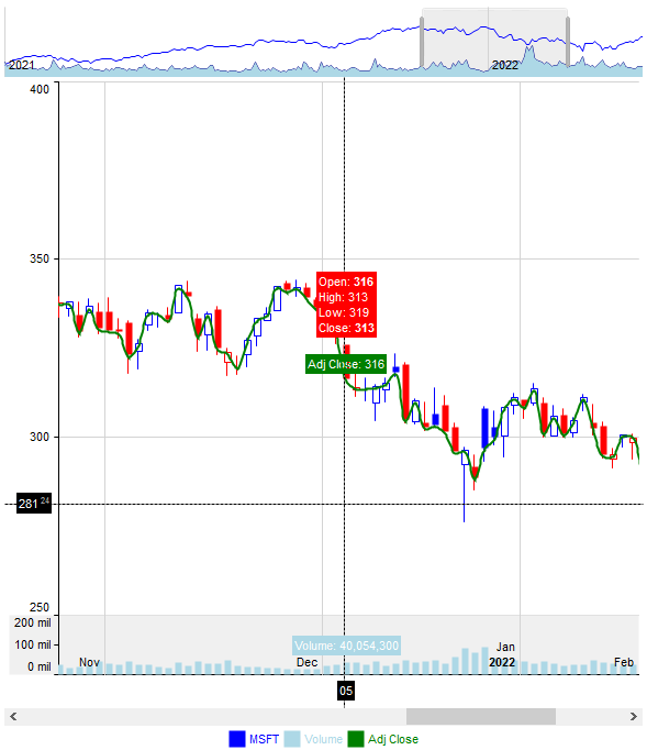
The Graph control supports the following events:

The Graph control supports the following events:


| Name | Description | |||
| AllowMoveValue | Defines the key combination that lets the user move or rearrange values or series within the chart, by drag-and-drop. | |||
| AllowScroll | Defines the key combination that lets the user to scroll the chart by drag and drop. | |||
| AllowStack | Specifies whether the series are stacked based on the non-empty values defined in the Stack property. | |||
| AllowValueResize | Defines the key combination that lets the user to resize the chart by drag and drop. | |||
| AnchorFromPoint | Retrieves the identifier of the anchor from point. | |||
| Appearance | Retrieves or sets the control's appearance. | |||
| AttachTemplate | Attaches a script to the current object, including the events, from a string, file, a safe array of bytes. | |||
| AutoFit | Specifies whether the control resizes the elements of the series to fit the control's content | |||
| BackColor | Specifies the control's background color. | |||
| Background | Returns or sets a value that indicates the background color for parts in the control. | |||
| BeginUpdate | Maintains performance when items are added to the control one at a time. This method prevents the control from painting until the EndUpdate method is called. | |||
| BorderHeight | Sets or retrieves a value that indicates the border height of the control. | |||
| BorderWidth | Sets or retrieves a value that indicates the border width of the control. | |||
| CategoryAxes | Gets the category-axes object. | |||
| CategoryAxis | Creates and gets the first category-axis of the view. | |||
| Cursor | Gets the options to configure the control's cursor. | |||
| CursorFromPoint | Returns information from the cursor position as a string, separated by new lines: x, y, and valueCategory. | |||
| Data | Defines the source the control imports data from | |||
| DataOptions | Defines the options to import data. The method has effect only next time the Data property is called. | |||
| DataSample | Retrieves a data sample. | |||
| DataSource | Retrieves or sets a value that indicates the data source for object. | |||
| Enabled | Enables or disables the control. | |||
| EndUpdate | Resumes painting the control after painting is suspended by the BeginUpdate method. | |||
| EventParam | Retrieves or sets a value that indicates the current's event parameter. | |||
| ExecuteTemplate | Executes a template and returns the result. | |||
| Font | Retrieves or sets the control's font. | |||
| ForeColor | Specifies the control's foreground color. | |||
| FormatABC | Formats the A,B,C values based on the giving expression and returns the result. | |||
| FormatAnchor | Specifies the visual effect for anchor elements in HTML captions. | |||
| FormatText | Specifies the format to display the view's invalid label | |||
| FreezeEvents | Prevents the control to fire any event. | |||
| HTMLPicture | Adds or replaces a picture in HTML captions. | |||
| hWnd | Retrieves the control's window handle. | |||
| Images | Sets at runtime the control's image list. The Handle should be a handle to an Images List Control. | |||
| ImageSize | Retrieves or sets the size of icons the control displays. | |||
| Import | Imports the control's data from a CSV format | |||
| Invalid | Specifies the label the control is displaying while no or invalid data | |||
| Legend | Gets the control's legend panel. | |||
| Misc | Defines the control's miscellaneous options | |||
| MultiColorSerie | Determines whether a single data series (single-valid serie) in a chart can use multiple colors for its data points instead of a single uniform color. | |||
| Order | Specifies the custom order in which values or categories are displayed in the chart. | |||
| Overview | Gets the control's overview panel. | |||
| Pad | Defines the chart's padding (space between the chart's content and its border) | |||
| Picture | Retrieves or sets a graphic to be displayed in the control. | |||
| PictureDisplay | Retrieves or sets a value that indicates the way how the graphic is displayed on the control's background | |||
| Refresh | Refreses the control. | |||
| ReplaceIcon | Adds a new icon, replaces an icon or clears the control's image list. | |||
| Reset | Resets the series, category axes and value axes without affecting the control's data. | |||
| ScrollBars | Returns or sets a value that determines whether the control has horizontal and/or vertical scroll bars. | |||
| ScrollButtonHeight | Specifies the height of the button in the vertical scrollbar. | |||
| ScrollButtonWidth | Specifies the width of the button in the horizontal scrollbar. | |||
| ScrollFont | Retrieves or sets the scrollbar's font. | |||
| ScrollHeight | Specifies the height of the horizontal scrollbar. | |||
| ScrollOrderParts | Specifies the order of the buttons in the scroll bar. | |||
| ScrollPartCaption | Specifies the caption being displayed on the specified scroll part. | |||
| ScrollPartCaptionAlignment | Specifies the alignment of the caption in the part of the scroll bar. | |||
| ScrollPartEnable | Indicates whether the specified scroll part is enabled or disabled. | |||
| ScrollPartVisible | Indicates whether the specified scroll part is visible or hidden. | |||
| ScrollPos | Specifies the vertical/horizontal scroll position. | |||
| ScrollThumbSize | Specifies the size of the thumb in the scrollbar. | |||
| ScrollToolTip | Specifies the tooltip being shown when the user moves the scroll box. | |||
| ScrollWidth | Specifies the width of the vertical scrollbar. | |||
| Series | Gets the series object. | |||
| SeriesColors | Defines the default colors for the chart's series | |||
| SeriesColorsDecrease | Defines the default colors for the chart's series (when the value goes down) | |||
| SerieType | Indicates the representation method for the data in all series where the type property is not specified, determining how these series are visually displayed. | |||
| ShowImageList | Specifies whether the control's image list window is visible or hidden. | |||
| ShowToolTip | Shows the specified tooltip at given position. | |||
| Sort | Defines the list of series to be sorted, separated by spaces | |||
| Template | Specifies the control's template. | |||
| TemplateDef | Defines inside variables for the next Template/ExecuteTemplate call. | |||
| TemplatePut | Defines inside variables for the next Template/ExecuteTemplate call. | |||
| ToolTipDelay | Specifies the time in ms that passes before the ToolTip appears. | |||
| ToolTipFont | Retrieves or sets the tooltip's font. | |||
| ToolTipFormat | Specifies the expression to customize the tooltip (shown while the cursor hovers value-points of the chart) | |||
| ToolTipMargin | Defines the size of the control's tooltip margins. | |||
| ToolTipPopDelay | Specifies the period in ms of time the ToolTip remains visible if the mouse pointer is stationary within a control. | |||
| ToolTipWidth | Specifies a value that indicates the width of the tooltip window, in pixels. | |||
| ValueAutoFit | Adjusts the column/bar size so that the entire chart fits within the client rectangle. | |||
| ValueAxes | Gets the value-axes object. | |||
| ValueAxis | Creates and gets the first value-axis of the view. | |||
| ValueFromPoint | Returns information from the cursor position as a string, separated by new lines: value, inner-values, index/count, percent, index-serie and index-category. | |||
| ValuePoint | Specifies the size, color, frame color and size of the value point, frame color, size and length of the value line, color, frame color, size and pad of the value-point's background, each separated by a comma. | |||
| ValueSize | Specifies the size to show a column or a bar within the chart | |||
| Version | Retrieves the control's version. | |||
| VisualAppearance | Retrieves the control's appearance. | |||
| XAxis | Defines the configuration-options for x-axis of xy-compatible chart-types ('scatter', 'scatterArea', 'scatterLine' or 'bubble') | |||
| YAxis | Defines the configuration-options for y-axis of xy-compatible chart-types ('scatter', 'scatterArea', 'scatterLine' or 'bubble') |