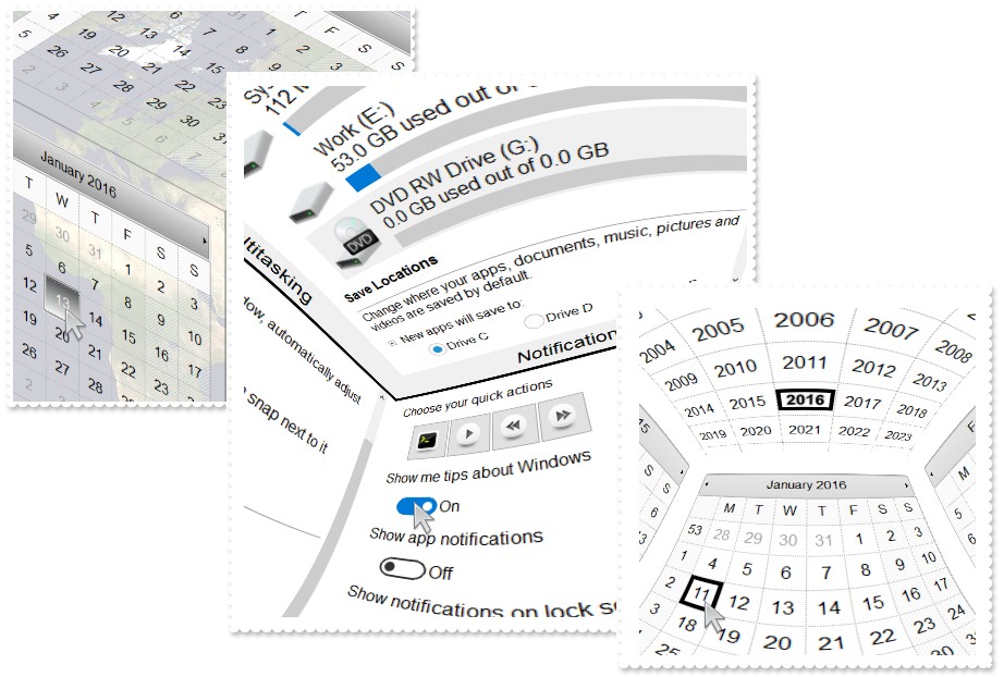
The
eXTreeCube library provides fisheye representation / cube map texturing of
different components such as calendar, multiple - columns tree view and so on.
Fish-eye lenses magnify the center of the field of view, while the scale being
reduced towards the edge. Cube map texturing is a form of environment texture
mapping that uses a viewing direction (3D vector) to map into a view plane the
six 2D textures arranged like the faces of a cube. You have unlimited options
to show any HTML text, images, colors, EBNs, patterns, frames anywhere on any
face of the cube. The eXTreeCube component lets the user changes its visual
appearance using skins, each one providing an additional visual experience
that enhances viewing pleasure. As usual, there are no dependencies to MFC,
VB, VCL, and of course, no Open GL required.
The following table shows how you can create / access different type of
objects ( red items indicates the name of the property/method ):
EXTREECUBELib.TreeCube
	"BottomFace" -> EXTREECUBELib.Face
	"DownFace" -> EXTREECUBELib.Face
	"Face(FaceEnum)" -> EXTREECUBELib.Face
	"FrontFace" -> EXTREECUBELib.Face
	"LeftFace" -> EXTREECUBELib.Face
	"RightFace" -> EXTREECUBELib.Face
	"TopFace" -> EXTREECUBELib.Face
	"VisualAppearance" -> EXTREECUBELib.Appearance
EXTREECUBELib.Face
	"CreateCalendar" -> EXTREECUBELib.FaceCalendar
	"CreatePicture" -> EXTREECUBELib.FacePicture
	"CreateTree" -> EXTREECUBELib.FaceTree
	"FaceCalendar" -> EXTREECUBELib.FaceCalendar
	"FacePicture" -> EXTREECUBELib.FacePicture
	"FaceTree" -> EXTREECUBELib.FaceTree
	"Neighbor(RotateEnum)" -> EXTREECUBELib.Face
EXTREECUBELib.FaceCalendar
	"Face" -> EXTREECUBELib.Face
EXTREECUBELib.FacePicture
	"Face" -> EXTREECUBELib.Face
EXTREECUBELib.FaceTree
	"Columns" -> EXTREECUBELib.Columns
	"Face" -> EXTREECUBELib.Face
	"ItemByIndex(Long)" -> EXTREECUBELib.Item
	"Items" -> EXTREECUBELib.Items
EXTREECUBELib.Columns
	"Add(String)" -> EXTREECUBELib.Column
	"Item(Variant)" -> EXTREECUBELib.Column
EXTREECUBELib.Item
	"Items" -> EXTREECUBELib.Items
	"Parent" -> EXTREECUBELib.Item
EXTREECUBELib.Items
	"Add(Variant)" -> EXTREECUBELib.Item
	"Item(Variant)" -> EXTREECUBELib.Item
The following table shows how you can create / access different type of
objects ( red items indicates the name of the property/method ):
EXTREECUBELib.Appearance <- "VisualAppearance" of EXTREECUBELib.TreeCube
EXTREECUBELib.Column <- "Add(String)" of EXTREECUBELib.Columns
EXTREECUBELib.Column <- "Item(Variant)" of EXTREECUBELib.Columns
EXTREECUBELib.Columns <- "Columns" of EXTREECUBELib.FaceTree
EXTREECUBELib.Face <- "BottomFace" of EXTREECUBELib.TreeCube
EXTREECUBELib.Face <- "DownFace" of EXTREECUBELib.TreeCube
EXTREECUBELib.Face <- "Face" of EXTREECUBELib.FaceTree
EXTREECUBELib.Face <- "Face(FaceEnum)" of EXTREECUBELib.TreeCube
EXTREECUBELib.Face <- "FrontFace" of EXTREECUBELib.TreeCube
EXTREECUBELib.Face <- "LeftFace" of EXTREECUBELib.TreeCube
EXTREECUBELib.Face <- "Neighbor(RotateEnum)" of EXTREECUBELib.Face
EXTREECUBELib.Face <- "RightFace" of EXTREECUBELib.TreeCube
EXTREECUBELib.Face <- "TopFace" of EXTREECUBELib.TreeCube
EXTREECUBELib.FaceCalendar <- "CreateCalendar" of EXTREECUBELib.Face
EXTREECUBELib.FaceCalendar <- "FaceCalendar" of EXTREECUBELib.Face
EXTREECUBELib.FacePicture <- "CreatePicture" of EXTREECUBELib.Face
EXTREECUBELib.FacePicture <- "FacePicture" of EXTREECUBELib.Face
EXTREECUBELib.FaceTree <- "CreateTree" of EXTREECUBELib.Face
EXTREECUBELib.FaceTree <- "FaceTree" of EXTREECUBELib.Face
EXTREECUBELib.Item <- "Add(Variant)" of EXTREECUBELib.Items
EXTREECUBELib.Item <- "Item(Variant)" of EXTREECUBELib.Items
EXTREECUBELib.Item <- "ItemByIndex(Long)" of EXTREECUBELib.FaceTree
EXTREECUBELib.Item <- "Parent" of EXTREECUBELib.Item
EXTREECUBELib.Items <- "Items" of EXTREECUBELib.Item
The TreeCube object supports the following properties and methods:
| | Name | Description | |
| | Aliasing | Specifies how the texture is rendered. | |
| | AllowEnsureVisibleFaceOnKey | Specifies whether the user can navigate through the faces using the keys. | |
| | AllowRotate | Specifies the directions where the user can drag the cube. | |
| | AlwaysEnsureVisibleFace | Ensures that always the face fits the control's client area. | |
| | AnchorFromPoint | Retrieves the identifier of the anchor from point. | |
| | Appearance | Retrieves or sets the control's appearance. | |
| | AttachTemplate | Attaches a script to the current object, including the events, from a string, file, a safe array of bytes. | |
| | BackColor | Specifies the control's background color. | |
| | Background | Returns or sets a value that indicates the background color for parts in the control. | |
| | BeginUpdate | Maintains performance when items are added to the control one at a time. This method prevents the control from painting until the EndUpdate method is called. | |
| | BottomFace | Returns the bottom face of the cube. | |
| | CancelLayoutChanging | Cancels the current layout changing operation. | |
| | CheckBoxHeight | Gets or sets a value that indicates the height in pixels to display the check-boxes. | |
| | CheckBoxWidth | Gets or sets a value that indicates the width in pixels to display the check-boxes. | |
| | DefaultFaceType | Specifies the default type of control to put on all faces. | |
| | DownFace | Returns the down face of the cube. | |
| | Enabled | Enables or disables the control. | |
| | EndUpdate | Resumes painting the control after painting is suspended by the BeginUpdate method. | |
| | EnsureVisibleFace | Ensures that giving face fits the control's client area. | |
| | EnsureVisibleFaceMargin | Specifies the size of the margin ( left / right ) of the cube's client area to ensure that a face fits it. | |
| | EnsureVisibleFaceOnDblClick | Ensures that the face being double clicked fits the cube's client area. | |
| | EnsureVisibleFaces | Specifies the comma-separated list of faces that can be visible. | |
| | EventParam | Retrieves or sets a value that indicates the current's event parameter. | |
| | ExecuteTemplate | Executes a template and returns the result. | |
| | Face | Returns the giving face of the cube. | |
| | FaceFromPoint | Retrieves the index of the face from the point. | |
| | Font | Retrieves or sets the control's font. | |
| | ForeColor | Specifies the control's foreground color. | |
| | FormatAnchor | Specifies the visual effect for anchor elements in HTML captions. | |
| | FrontFace | Returns the front face of the cube. | |
| | HasButtons | Adds a button to the left side of each parent item. The user can click the button to expand or collapse the child items as an alternative to double-clicking the parent item. | |
| | HTMLPicture | Adds or replaces a picture in HTML captions. | |
| | hWnd | Retrieves the control's window handle. | |
| | IdentifyFace | Specifies whether each face shows its index/frame. | |
| | IdentifyFaceCaption | Specifies the HTML caption to show the index/name of the face. | |
| | Images | Sets at runtime the control's image list. The Handle should be a handle to an Images List Control. | |
| | ImageSize | Retrieves or sets the size of icons the control displays.. | |
| | Internals | Specifies internal values. | |
| | LeftFace | Returns the left face of the cube. | |
| | Margins | Sets or retrieves a value that indicates the margins of the faces within the cube. | |
| | OnMouseWheel | Specifies what action the control performs when user rolls the mouse wheel. | |
| | Picture | Retrieves or sets a graphic to be displayed in the control. | |
| | PictureDisplay | Retrieves or sets a value that indicates the way how the graphic is displayed on the control's background | |
| | RadioButtonHeight | Gets or sets a value that indicates the height in pixels to display the radio-buttons. | |
| | RadioButtonWidth | Gets or sets a value that indicates the width in pixels to display the radio-buttons. | |
| | Refresh | Refreses the control. | |
| | ReplaceIcon | Adds a new icon, replaces an icon or clears the control's image list. | |
| | RightFace | Returns the right face of the cube. | |
| | Rotate | Rotates the cube in a direction. | |
| | RotX | Specifies the rotation angle in Radians along Ox axis. | |
| | RotY | Specifies the rotation angle in Radians along Oy axis. | |
| | ShowAs | Indicates the way the cube is displayed. | |
| | ShowImageList | Specifies whether the control's image list window is visible or hidden. | |
| | ShowToolTip | Shows the specified tooltip at given position. | |
| | Template | Specifies the control's template. | |
| | TemplateDef | Defines inside variables for the next Template/ExecuteTemplate call. | |
| | TexturePictureExt | Specifies the comma-separated list of graphics format/extension to be tried to load by the TexturePicturePath property. | |
| | TexturePictureHeight | Specifies the height in pixels, to render the pictures on the faces. | |
| | TexturePicturePath | Specifies the path to load the faces/pictures. | |
| | TexturePictureWidth | Specifies the width in pixels, to render the pictures on the faces. | |
| | ToolTipDelay | Specifies the time in ms that passes before the ToolTip appears. | |
| | ToolTipFont | Retrieves or sets the tooltip's font. | |
| | ToolTipPopDelay | Specifies the period in ms of time the ToolTip remains visible if the mouse pointer is stationary within a control. | |
| | ToolTipWidth | Specifies a value that indicates the width of the tooltip window, in pixels. | |
| | TopFace | Returns the top face of the cube. | |
| | Transparent | Gets or sets a value that indicates percent of the transparency to display the pictures on the cube. | |
| | TransparentContent | Gets or sets a value that indicates percent of the transparency to display the content of the face within the cube. | |
| | UseVisualTheme | Specifies whether the control uses the current visual theme to display certain UI parts. | |
| | Version | Retrieves the control's version. | |
| | VisibleFace | Indicates the currently visible face. | |
| | VisualAppearance | Retrieves the control's appearance. | |
| | Zoom | Zooms the view. | |

