The
Item object holds information about an item to be displayed on a
exFaceTree
type. The
Type property specifies the type of the
face. The
exFaceTree type can display one
or multiple columns.
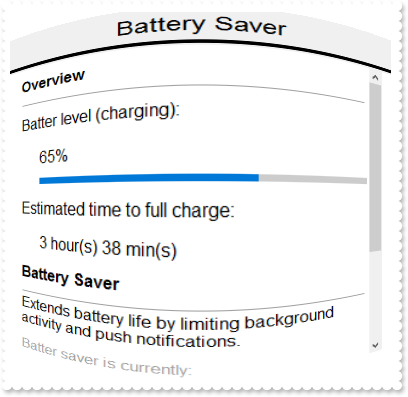
The following screen shot shows a FaceTree with multiple items:

The following table shows how you can get a Item object ( the red items
indicates properties )
EXTREECUBELib.FaceTree
	"ItemByIndex(Long)" -> EXTREECUBELib.Item
EXTREECUBELib.Items
	"Add(Variant)" -> EXTREECUBELib.Item
	"Item(Variant)" -> EXTREECUBELib.Item
EXTREECUBELib.Item
	"Parent" -> EXTREECUBELib.Item
The following table shows how you can get a Item object ( the red items
indicates properties )
EXTREECUBELib.Item <- "Add(Variant)" of EXTREECUBELib.Items
EXTREECUBELib.Item <- "Item(Variant)" of EXTREECUBELib.Items
EXTREECUBELib.Item <- "ItemByIndex(Long)" of EXTREECUBELib.FaceTree
EXTREECUBELib.Item <- "Parent" of EXTREECUBELib.Item
The Item object supports the following properties and methods:
| | Name | Description | |
| | BackColor | Specifies the item's background color. | |
| | BackgroundExt | Indicates additional colors, text, images that can be displayed on the cell's background using the EBN string format. | |
| | BackgroundExtValue | Specifies at runtime, the value of the giving property for specified part of the background extension. | |
| | Bold | Indicates that the item should appear as bold. | |
| | Caption | Returns the cell's caption. | |
| | CellParent | Retrieves the parent of an inner cell. | |
| | CellWidth | Retrieves or sets a value that indicates the width of the inner cell. | |
| | Divider | Specifies whether the item acts like a divider item. The value indicates the index of column used to define the divider's title. | |
| | DividerLine | Defines the type of line in the divider item. | |
| | DividerLineAlignment | Specifies the alignment of the line in the divider item. | |
| | Enabled | Enables or disables the item. | |
| | Expanded | Expands or collapses the item. | |
| | ForeColor | Specifies the item's foreground color. | |
| | FormatCell | Specifies the format to display the cell's content. | |
| | HasButton | Retrieves or sets a value indicating whether the cell has a button associated or not. | |
| | HasCheckBox | Retrieves or sets a value indicating whether the cell has a checkbox associated or not. | |
| | HasRadioButton | Retrieves or sets a value indicating whether the cell has a radiobutton associated or not. | |
| | Height | Specifies the item's height. | |
| | Index | Indicates the index of the item. | |
| | InnerCell | Retrieves the inner cell. | |
| | Italic | Indicates that the item should appear in italics. | |
| | Items | Gets the item's child collection. | |
| | Parent | Indicates the item's parent. | |
| | Position | Specifies the item's position. | |
| | RadioGroup | Retrieves or sets a value whether the radio button group. | |
| | Remove | Removes the item. | |
| | Selectable | Specifies whether the item is selectable. | |
| | SingleLine | Indicates whether the cell is displayed on a single or multiple lines. | |
| | SplitCell | Splits a cell, and returns the inner created cell. | |
| | State | Specifies the cell's state / checked / unchecked. | |
| | StrikeOut | Indicates that the item should appear as strikeout. | |
| | ToString | Loads or saves the Item object using string representation. | |
| | Underline | Indicates that the item should appear as underlined. | |
| | UnsplitCell | Unsplits a cell. | |
| | UserData | Specifies the cell's user data. | |
| | Value | Specifies the cell's value. | |


