The
FaceTree object displays and handles a Tree-View control.
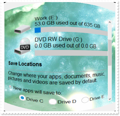
The following screen shot shows a FaceTree assigned to a face:

The following table shows how you can get a
FaceTree object ( the red items
indicates properties )
EXTREECUBELib.Face
	"CreateTree" -> EXTREECUBELib.FaceTree
	"FaceTree" -> EXTREECUBELib.FaceTree
The following table shows how you can get a FaceTree object ( the red items
indicates properties )
EXTREECUBELib.FaceTree <- "CreateTree" of EXTREECUBELib.Face
EXTREECUBELib.FaceTree <- "FaceTree" of EXTREECUBELib.Face
The FaceTree object supports the following properties and
methods:
| | Name | Description | |
| | BackColorHeader | Specifies the header's background color. | |
| | Caption | Indicates the caption of the selected cell. | |
| | CaptionFromPoint | Retrieves the caption from the point. | |
| | ColumnAutoResize | Returns or sets a value indicating whether the control will automatically size its visible columns to fit on the control's client width. | |
| | ColumnFromPoint | Retrieves the index of the column from the point. | |
| | Columns | Returns the Columns collection. | |
| | DrawGridLines | Retrieves or sets a value that indicates whether the grid lines are visible or hidden. | |
| | EnsureVisibleColumn | Ensures the given column fits the visible client area. | |
| | EnsureVisibleItem | Ensures the given item fits the visible client area. | |
| | ExpandOnDblClick | Specifies whether the item is expanded or collapsed if the user double clicks the item. | |
| | Face | Retrieves the face that owns the content object. | |
| | ForeColor | Specifies the tree's foreground color. | |
| | ForeColorHeader | Specifies the header's foreground color. | |
| | FullRowSelect | Enables full-row selection in the control. | |
| | GetItems | Gets the collection of items into a safe array, | |
| | GridLineColor | Specifies the grid line color. | |
| | GridLineStyle | Specifies the style for gridlines in the list part of the control. | |
| | HasLines | Enhances the graphic representation of a tree control's hierarchy by drawing lines that link child items to their corresponding parent item. | |
| | HeaderHeight | Retrieves or sets a value indicating the control's header height. | |
| | HeaderVisible | Retrieves or sets a value that indicates whether the tree's header is visible or hidden. | |
| | Indent | Retrieves or sets the amount, in pixels, that child items are indented relative to their parent items. | |
| | Index | Indicates the index of the face. | |
| | ItemByIndex | Retrieves the item giving its index. | |
| | ItemFromPoint | Retrieves the index of the item from the point. | |
| | ItemPadding | Retrieves or sets the item's default padding. | |
| | Items | Returns the Items collection. | |
| | ItemsCount | Indicates the number of items. | |
| | Layout | Saves or loads the control's layout, such as positions of the columns, scroll position, filtering values. | |
| | LinesAtRoot | Link items at the root of the hierarchy. | |
| | PutItems | Adds an array of integer, long, date, string, double, float, or variant arrays to the control. | |
| | Refresh | Refreses the face's content. | |
| | SelBackColor | Retrieves or sets a value that indicates the selection background color. | |
| | SelectColumn | Specifies the index of the column being selected. | |
| | SelectItem | Specifies the index of the item being selected. | |
| | SelForeColor | Retrieves or sets a value that indicates the selection foreground color. | |
| | ShowSelection | Specifies whether the selection is shown or hidden. | |
| | SortOnClick | Retrieves or sets a value that indicates whether the control sorts automatically the data when the user click on column's caption. | |
| | TreeColumnIndex | Retrieves or sets a value indicating the column's index where the hierarchy will be displayed. | |
| | Value | Indicates the value of the selected cell. | |
| | ValueFromPoint | Retrieves the value from the point. | |
| | VisibleItemsCount | Indicates the number of visible items. | |


