| 99 |
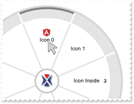
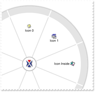
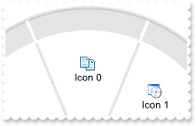
How can I replace or add an icon at runtime
|
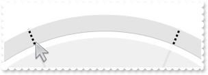
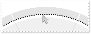
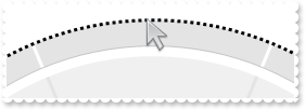
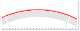
| 98 |
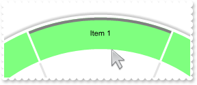
I need to be able to select hours and minutes, like a clock or slider 0-24h and 0-60 min
|
| 97 |
Display a custom tooltip
|
| 96 |
Shows the tooltip of the object moved relative to its default position
|
| 95 |
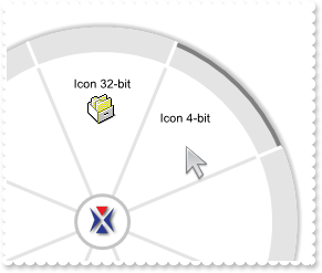
The control shows no icons. What can be the problem (32-bit, alpha channel vs 4-bit icons problem)
|
| 94 |
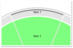
ImageSize property on 32 (specifies the size of control' icons/images)
|
| 93 |
ImageSize property on 16 (specifies the size of control' icons/images)
|
| 92 |
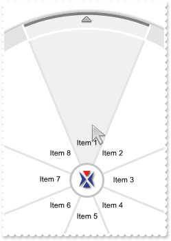
How can I displays items rotated (exDisplayRadialRotated90)
|
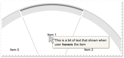
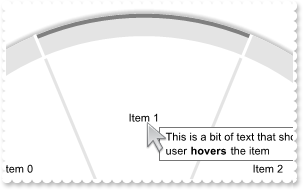
| 91 |
How can I displays items rotated (exDisplayRadialRotated270)
|
| 90 |
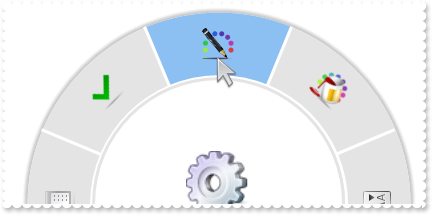
How can I displays items rotated (exDisplayRadialRotated180)
|
| 89 |
How can I displays items rotated (exDisplayRadialRotated)
|
| 88 |
How do I load images to sub-items zone
|
| 87 |
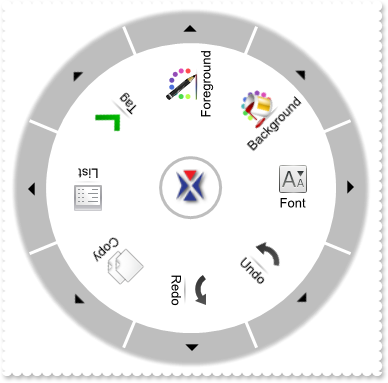
How can I display the control directly on the screen
|
| 86 |
How do I add a radial-slider control
|
| 85 |
How can I display a slider directly on the radial menu, with no items...
|
| 84 |
How can I programatically browses for a new item
|
| 83 |
How can I display the items rotated
|
| 82 |
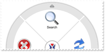
Is it possible to display the arrow into the items section, and how I can change the default position
|
| 81 |
Can I display the arrow into the items section
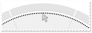
|
| 80 |
How can I know if the cursor is hovering the center ring ( parent zone )
|
| 79 |
How can I specify the size to display the images/pictures into the items
|
| 78 |
By default, the parent image is 32-pixels wide. Can I display it larger
|
| 77 |
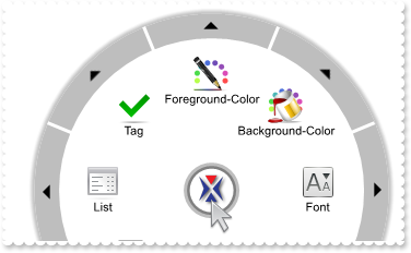
Is it possible to specify where to display the item's caption
|
| 76 |
How can I disable browsing the items, or prevent displaying its children
|
| 75 |
How do I get the item from the point
|
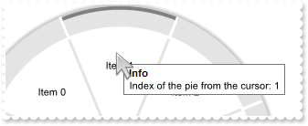
| 74 |
How do I get the index of the pie from the point
|
| 73 |
How can I select an item
|
| 72 |
How can I use the sub-items zone only
|
| 71 |
Is it possible to display all items with a different rotation angle
|
| 70 |
How can I programatically advance / browse for the parent item (method 2)
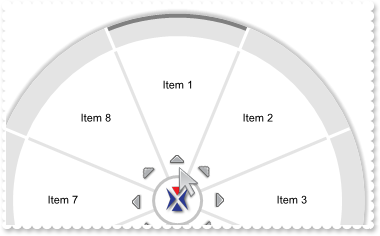
|
| 69 |
How can I programatically advance / browse for the parent item (method 1)
|
| 68 |
Can I display the pointer with a different angle
|
| 67 |
How can I use the pointer (select sample)
|
| 66 |
How can I use the pointer (hot sample)
|
| 65 |
Is it possible to apply the control's background picture on the parent zone too
|
| 64 |
Can I display the picture on the parent zone, a bit larger
|
| 63 |
Is it possible to assign a different background picture when displaying a slider/custom data
|
| 62 |
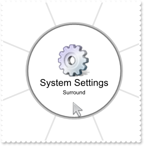
How can I customize the custom part of the control, the inside ring/circle
|
| 61 |
How do I prevent expanding / collapsing the radial menu
|
| 60 |
Is it possible to change the parent's picture/image when expanding collapsing the radial menu
|
| 59 |
Is it possible to assign a different picture on the parent zone (center ring)
|
| 58 |
Is it possible to assign a different picture on the items zone (inner ring)
|
| 57 |
How can I change the control's background picture
|
| 56 |
How can I hide the line being shown around the item form the cursor
|
| 55 |
Is it possible to highlight items with children, with a different background color, for those arrow picture is shown (items, inner ring)
|
| 54 |
Is it possible to highlight items with children, with a different background color, for those arrow picture is shown (subitems, outer ring)
|
| 53 |
Is it possible to highlight the entire item, when cursor hovers it
|
| 52 |
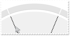
How can I change the border around the subitems zone, when cursor hovers it ( outer ring )
|
| 51 |
How can I change the border around the subitems zone, when cursor hovers it ( outer ring )
|
| 50 |
How can I change the border around the items zone, when cursor hovers it ( inner ring )
|
| 49 |
How can I change the border around the parent zone, when cursor hovers it ( center ring )
|
| 48 |
How can I change the border around the items zone ( inner ring )
|
| 47 |
How can I change the border around the parent zone ( center ring )
|
| 46 |
How can I change the grid lines in the items zone ( inner ring )
|
| 45 |
How can I change the border around the slider / custom part of the control
|
| 44 |
How can I change the grid lines in the subitems zone ( outer ring )
|
| 43 |
How can I change the border around the subitems (exRadialSubItemsBorder)
|
| 42 |
How can I change the border around the radial menu (exRadialBorder)
|
| 41 |
How can I customize the parent part of the control, the center ring/circle
|
| 40 |
How can I prevent showing the arrow in the outer ring
|
| 39 |
Is it possible to change the default arrow, that items with children display (method 2)
|
| 38 |
Is it possible to change the default arrow, that items with children display (method 1)
|
| 37 |
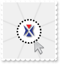
How can I change the logo image
|
| 36 |
How can I customize the items part of the control, the inside ring/circle
|
| 35 |
How can I customize the subitems part of the control, the outside ring/circle
|
| 34 |
Can I expand/shrink the radial menu relative to its border/shadow
|
| 33 |
Is it possible to remove/hive the control's shadow
|
| 32 |
How do I change the color of the control's shadow
|
| 31 |
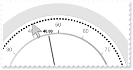
How can I evaluate/format an expression using the control
|
| 30 |
Is it possible to display some extra captions on the control's background
|
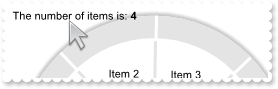
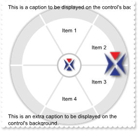
| 29 |
What events the control supports
|
| 28 |
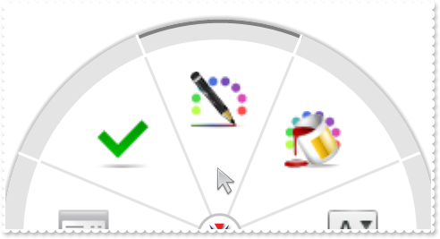
How can I use/load images/pictures
|
| 27 |
Does your control supports tooltips (method 2)
|
| 26 |
Can I change the visual appearance of the control's tooltip
|
| 25 |
Does your control supports tooltips (method 1)
|
| 24 |
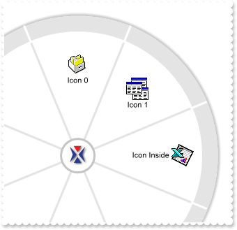
How can I use/load icons
|
| 23 |
How can I load items /images to the control, in sub-items zone
|
| 22 |
How can I load items /images to the control
|
| 21 |
How can I load items to the control
|
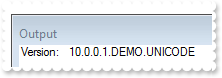
| 20 |
How do I get the version of the control I am running
|
| 19 |
How do I select an item
|
| 18 |
How can I change the item's foreground color (sample 3)
|
| 17 |
How can I change the item's foreground color (sample 2)
|
| 16 |
How can I change the item's foreground color (sample 1)
|
| 15 |
How can I add new items / childrend to the control (method 2)
|
| 14 |
How can I add new items / childrend to the control (method 1)
|
| 13 |
How do I enlarge the font (method 2)
|
| 12 |
How do I enlarge the font (method 1)
|
| 11 |
How can I expand the control (method 2)
|
| 10 |
How can I expand the control (method 1)
|
| 9 |
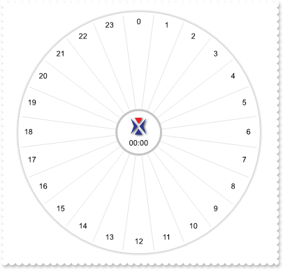
By default, the control displays 8-pies. How can I change that
|
| 8 |
How can I prevents expanding / collapsing the radial menu
|
| 7 |
How can I prevent flickering the item, when user selects it
|
| 6 |
How do I highlight the sub-item zone when cursor hovers it (method 2)
|
| 5 |
How do I highlight the sub-item zone when cursor hovers it (method 1)
|
| 4 |
Is it possible to highlight the entire item when cursor hovers the item
|
| 3 |
How can I hide the hot line when hovering the cursor
RadialMenu1->AllowToggleExpand = false; RadialMenu1->RadialLineSize[Exradialmenulib_tlb::RadialLineEnum::exRadialHotFullItem] = 0; Exradialmenulib_tlb::IItemsPtr var_Items = RadialMenu1->Items; var_Items->Add(L"Item A",TNoParam(),TNoParam()); var_Items->Add(L"Item B",TNoParam(),TNoParam()); var_Items->Add(L"Item C",TNoParam(),TNoParam()); |
| 2 |
How can I hide the control's shadow
|
| 1 |
How do I change the control's background color
RadialMenu1->BackColor = RGB(240,240,249); |