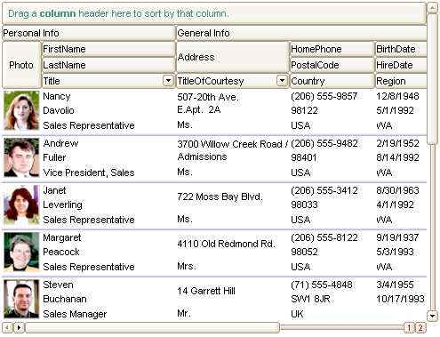
The TableView mode shows the items as rows in a table. The user can customize the layout of the fields in the row using the CellFormatLevel property.
The image below shows an example of TableView mode:

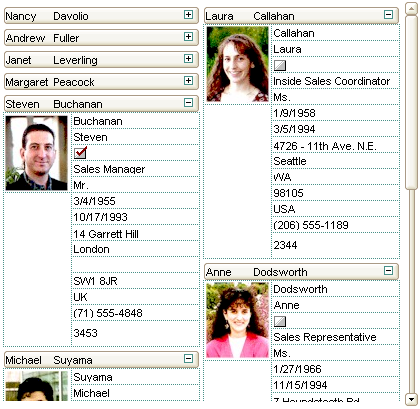
The CardView mode represents the view displaying data using cards. The user can customize the layout of the fields in the card or in the title of the card using the ViewModeOption(exCardViewFormat) ViewModeOption(exCardViewTitleFormat) properties. The control allows displaying cards from left to right or top to bottom, auto-arranging, resizing cards, expand or collapse cards support and much more.
The image below shows an example of CardView mode:


