| | Name | Value | Description | |
| |
exHeaderFilterBarButton | 0
|
Specifies the background color for the drop down filter bar button. Use the DisplayFilterButton
property to specify whether the drop down filter bar button is visible or
hidden.

| |
| |
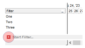
exFooterFilterBarButton | 1
|
Specifies the background color for the closing button in the filter bar (-1
hides the closing button in the filter bar). Use
the ClearFilter method to remove the filter
from the control.
| |
| |
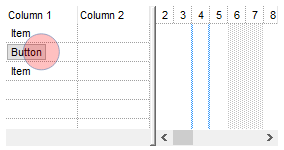
exCellButtonUp | 2
|
Specifies the background color for the cell's button, when it is up. Use the CellHasButton
property to assign a button to a cell.
| |
| |
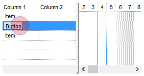
exCellButtonDown | 3
|
Specifies the background color for the cell's button, when it is down. Use the CellHasButton
property to assign a button to a cell.
| |
| |
exDropDownButtonUp | 4
|
Specifies the visual appearance for the drop down button, when it is up. Usually
the editors with a drop down portion displays a drop down button.

| |
| |
exDropDownButtonDown | 5
|
Specifies the visual appearance for the drop down button, when it is down.
Usually the editors with a drop down portion displays a drop down button.

| |
| |
exButtonUp | 6
|
Specifies the visual appearance for the button inside the editor, when it is up.
Use the AddButton method to add new buttons
to an editor.

| |
| |
exButtonDown | 7
|
Specifies the visual appearance for the button inside the editor, when it is
down. Use the AddButton method to add new
buttons to an editor.

| |
| |
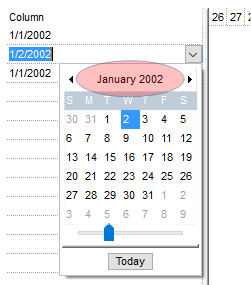
exDateHeader | 8
|
Specifies the visual appearance for the header in a calendar control. The DateType
editor allows user to select dates from a drop down calendar panel.
| |
| |
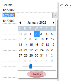
exDateTodayUp | 9
|
Specifies the visual appearance for the today button in a calendar control, when it is
up. The DateType editor allows user to
select dates from a drop down calendar panel.
| |
| |
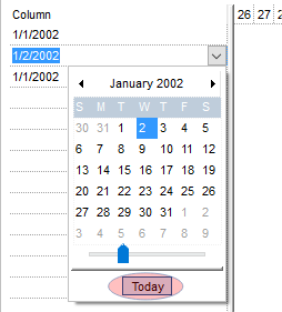
exDateTodayDown | 10
|
Specifies the visual appearance for the today button in a calendar control, when it is
down. The DateType editor allows user to
select dates from a drop down calendar panel.
| |
| |
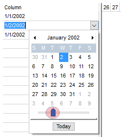
exDateScrollThumb | 11
|
Specifies the visual appearance for the scrolling thumb in a calendar control. The DateType
editor allows user to select dates from a drop down calendar panel.
| |
| |
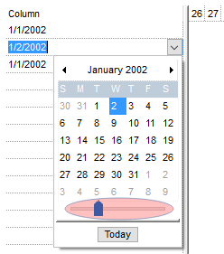
exDateScrollRange | 12
|
Specifies the visual appearance for the scrolling range in a calendar control. The DateType
editor allows user to select dates from a drop down calendar panel.
| |
| |
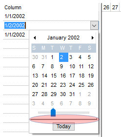
exDateSeparatorBar | 13
|
Specifies the visual appearance for the separator bar in a calendar control. The DateType
editor allows user to select dates from a drop down calendar panel.
| |
| |
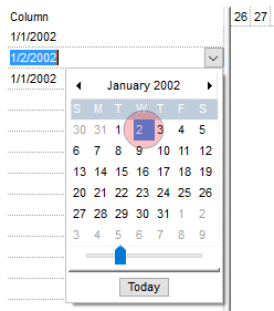
exDateSelect | 14
|
Specifies the visual appearance for the selected date in a calendar control. The DateType
editor allows user to select dates from a drop down calendar panel.
| |
| |
exSliderRange | 15
|
exSliderRange. Specifies the visual appearance for the slider's bar.
| |
| |
exSliderThumb | 16
|
exSliderThumb. Specifies the visual appearance for the thumb of the slider.
| |
| |
exSelectInPlace | 17
|
Specifies the visual appearance for the selection when a drop down editor is focused and closed.
The option is valid for drop-down list editors (CheckListType, DropDownList).

| |
| |
exShowFocusRect | 19
|
Specifies the visual appearance to display the cell with the focus. The ShowFocusRect
property retrieves or sets a value indicating whether the control draws a thin rectangle
around the focused item.

| |
| |
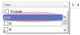
exSelBackColorFilter | 20
|
Specifies the visual appearance for the selection in the drop down filter window.
Use the exBackColorFilter option to specify the background color in the drop
down filter window.
| |
| |
exSelForeColorFilter | 21
|
Specifies the foreground color for the selection in the drop down filter window.
Use the exForeColorFilter option to specify the foreground color in the drop
down filter window.

| |
| |
exSpinUpButtonUp | 22
|
Specifies the visual appearance for the up spin button when it is not pressed.

| |
| |
exSpinUpButtonDown | 23
|
Specifies the visual appearance for the up spin button when it is pressed.

| |
| |
exSpinDownButtonUp | 24
|
Specifies the visual appearance for the down spin button when it is not pressed.

| |
| |
exSpinDownButtonDown | 25
|
Specifies the visual appearance for the down spin button when it is pressed.

| |
| |
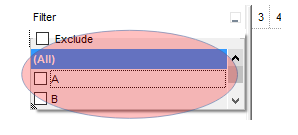
exBackColorFilter | 26
|
Specifies the background color for the drop down filter window. If not
specified, the BackColorHeader property
specifies the drop down filter's background color. Use the
exSelBackColorFilter option to specify the selection background visual
appearance in the drop down filter window.
| |
| |
exForeColorFilter | 27
|
Specifies the foreground color for the drop down filter window. If not
specified, the ForeColorHeader
property specifies the drop down filter's foreground color. Use the
exSelForeColorFilter option to specify the selection foreground color in the
drop down filter window.

| |
| |
exSortBarLinkColor | 28
|
Indicates the color or the visual appearance of the links between columns in the control's sort bar.

| |
| |
exCursorHoverColumn | 32
|
Specifies the visual appearance for the column when the cursor hovers the
column. By default, the exCursorHoverColumn property is zero, and it has no
effect, so the visual appearance for the column is not changed when the cursor
hovers the header.

| |
| |
exDragDropBefore | 33
|
Specifies the visual appearance for the drag and drop cursor before showing the
items. This option can be used to apply a background to the dragging items,
before painting the items.
| |
| |
exDragDropAfter | 34
|
Specifies the visual appearance for the drag and drop cursor after showing the
items. This option can be used to apply a semi-transparent/opaque background to
the dragging items, after painting the items. If the exDragDropAfter option is
set on white ( 0x00FFFFFF ), the image is not showing on OLE Drag and drop.
| |
| |
exDragDropListTop | 35
|
Specifies the graphic feedback of the item from the drag and drop cursor if the cursor is in the top half of the row.
Please note, that if a visual effect is specified for exDragDropListOver AND
exDragDropListBetween states, and a visual effect is specified for
exDragDropListTop OR/AND exDragDropListBottom state(s), the exDragDropListTop
visual effect is displayed ONLY if the cursor is over the first visible item,
and the exDragDropListBottom visual effect is shown ONLY for the last visible
item. Use the ItemFromPoint property to
retrieve the hit test code for the part from the cursor. This option can be
changed during the OLEDragOver event to change the visual effect for the item
from the cursor at runtime.
| |
| |
exDragDropListBottom | 36
|
Specifies the graphic feedback of the item from the drag and drop cursor if the cursor is in the bottom half of the row.
Please note, that if a visual effect is specified for exDragDropListOver AND
exDragDropListBetween states, and a visual effect is specified for
exDragDropListTop OR/AND exDragDropListBottom state(s), the exDragDropListTop
visual effect is displayed ONLY if the cursor is over the first visible item,
and the exDragDropListBottom visual effect is shown ONLY for the last visible
item. Use the ItemFromPoint property to
retrieve the hit test code for the part from the cursor. This option can be
changed during the OLEDragOver event to change the visual effect for the item
from the cursor at runtime.
| |
| |
exDragDropForeColor | 37
|
Specifies the foreground color for the items being dragged. By default, the
foreground color is black.
| |
| |
exDragDropListOver | 38
|
Specifies the graphic feedback of the item from the cursor if it is over the item.
Please note, that if a visual effect is specified for exDragDropListOver AND
exDragDropListBetween states, and a visual effect is specified for
exDragDropListTop OR/AND exDragDropListBottom state(s), the exDragDropListTop
visual effect is displayed ONLY if the cursor is over the first visible item,
and the exDragDropListBottom visual effect is shown ONLY for the last visible
item. Use the ItemFromPoint property to
retrieve the hit test code for the part from the cursor. This option can be
changed during the OLEDragOver event to change the visual effect for the item
from the cursor at runtime.
| |
| |
exDragDropListBetween | 39
|
Specifies the graphic feedback of the item when the drag and drop cursor is between items.
Please note, that if a visual effect is specified for exDragDropListOver AND
exDragDropListBetween states, and a visual effect is specified for
exDragDropListTop OR/AND exDragDropListBottom state(s), the exDragDropListTop
visual effect is displayed ONLY if the cursor is over the first visible item,
and the exDragDropListBottom visual effect is shown ONLY for the last visible
item. Use the ItemFromPoint property to
retrieve the hit test code for the part from the cursor. This option can be
changed during the OLEDragOver event to change the visual effect for the item
from the cursor at runtime.
| |
| |
exDragDropAlign | 40
|
Specifies the alignment of the drag and drop image relative to the cursor. By
default, the
exDragDropAlign option is 0, which initially the drag and drop image is shown
centered relative to the position of the cursor.
The valid values are listed as follows (hexa representation):
- 0x00000000, (default), the drag and drop image is shown centered relative
to the cursor, and shows up.
- 0x01000000, (left), the drag and drop image is shown to the left of the
cursor.
- 0x02000000, (right), the drag and drop image is shown to the right of the
cursor.
- 0x04000000, (center-down), the drag and drop image is shown centered
relative to the cursor, and shows down.
- 0xFF000000, (as- is), the drag and drop image is shown as it is clicked.
| |
| |
exHeaderFilterBarActive | 41
|
Specifies the visual appearance of the drop down filter bar button, while filter is applied to the column.

| |
| |
exToolTipAppearance | 64
|
Specifies the visual style or appearance of the tooltip borders (EBN color). By default, the tooltip's frame is defined by the current theme using the "TOOLTIP" class, with part TTP_STANDARD (1) and state TTBS_NORMAL (1). You can review all available classes, parts, and states in the current visual theme through the control�s VisualDesign property page. The ToolTipPopDelay property determines how long (in milliseconds) the tooltip remains visible while the mouse pointer is stationary over the control. The ToolTipDelay property specifies the delay (in milliseconds) before the tooltip is displayed. Use the ToolTipWidth property to define the width of the tooltip window, and the CellToolTip property to assign a tooltip to a specific cell. Use
the ShowToolTip method to display a custom
tooltip

| |
| |
exToolTipBackColor | 65
|
Specifies the tooltip's background color (RGB color).

| |
| |
exToolTipForeColor | 66
|
Specifies the tooltip's foreground color (RGB color).

| |
| |
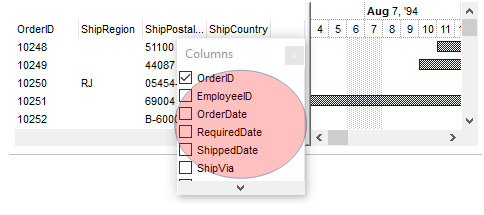
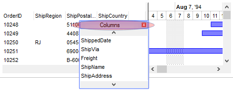
exColumnsFloatBackColor | 87
|
Specifies the background color for the Columns float bar.
| |
| |
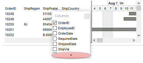
exColumnsFloatScrollBackColor | 88
|
Specifies the background color for the scroll bars in the Columns float bar.
| |
| |
exColumnsFloatScrollPressBackColor | 89
|
Specifies the background color for the scroll bars in the Columns float bar, while the scroll part is pressed.

| |
| |
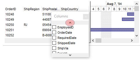
exColumnsFloatScrollUp | 90
|
Specifies the visual appearance of the up scroll bar.
| |
| |
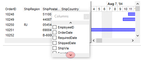
exColumnsFloatScrollDown | 91
|
Specifies the visual appearance of the down scroll bar.
| |
| |
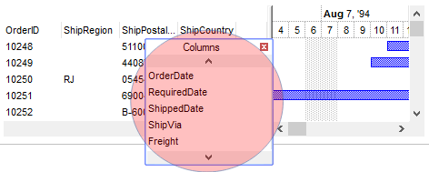
exColumnsFloatAppearance | 92
|
Specifies the visual appearance for the frame/borders of the Column's float bar.
The option has effect only if set before calling the ColumnsFloatBarVisible
property.
| |
| |
exColumnsFloatCaptionBackColor | 93
|
Specifies the visual appearance for caption, if the Background(exColumnsFloatAppearance) property is specified.

| |
| |
exColumnsFloatCaptionForeColor | 94
|
Specifies the foreground color for the caption, if the Background(exColumnsFloatAppearance) property is specified.
| |
| |
exColumnsFloatCloseButton | 95
|
exColumnsFloatCloseButton. Specifies the visual appearance for the closing button, if the Background(exColumnsFloatAppearance) property is specified.
| |
| |
exListOLEDropPosition | 96
|
By default, the
exListOLEDropPosition is 0, which means no effect. Specifies the visual appearance of the dropping position over the list part of the control, when it is implied in a OLE Drag and Drop operation.
The exListOLEDropPosition has effect only if different than 0, and the OLEDropMode
property is not exOLEDropNone. For instance, set the
Background(exListOLEDropPosition)
property on RGB(0,0,255), and a blue line is shown at the item where the cursor is hover the
list part of the control, during an OLE Drag
and Drop position. The OLEDragDrop
event notifies your application once an object is drop in the control.
| |
| |
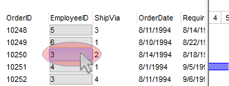
exCursorHoverCellButton | 157
|
Defines the visual appearance of the cell's button when the cursor hovers over it. By default, the exCursorHoverCellButton property is set to zero, indicating that the current theme manages the display of the cell's button during cursor hover. If the exCursorHoverCellButton property is set to -1, there will be no change in the visual appearance of the cell's button when the cursor hovers over it.
The CellHasButton property determines whether a button is displayed inside the cell.
 > >
| |
| |
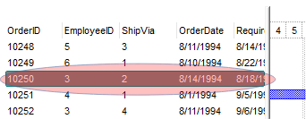
exSelBackColorHide | 166
|
Specifies the selection's background color, when the control has no focus. This has effect while the control's
HideSelection property is False
| |
| |
exSelForeColorHide | 167
|
Specifies the selection's foreground color, when the control has no focus. This has effect while the control's
HideSelection property is False

| |
| |
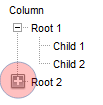
exTreeGlyphOpen | 180
|
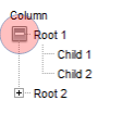
Specifies the visual appearance for the +/- buttons when it is collapsed. This option is valid while
HasButtons property is exPlus ( by default ), and any of Background(exTreeGlyphOpen)/Background(exTreeGlyphClose) is not-zero.
| |
| |
exTreeGlyphClose | 181
|
Specifies the visual appearance for the +/- buttons when it is expanded. This option is valid while
HasButtons property is exPlus ( by default ), and any of Background(exTreeGlyphOpen)/Background(exTreeGlyphClose) is not-zero
| |
| |
exColumnsPositionSign | 182
|
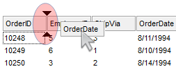
Specifies the visual appearance for the position sign between columns, when the user changes the position of the column by drag an drop.
The AllowDragging property specifies
whether the user can change the column's position by drag an drop.
| |
| |
exTreeLinesColor | 186
|
Specifies the color to show the tree-lines (connecting lines from the parent to the children).
The HasLines property enhances the graphic representation of a tree control's hierarchy by drawing lines that
link child items to their corresponding parent item.

| |
| |
exVSUp | 256
|
 align="top">
The up button in normal state. align="top">
The up button in normal state.
| |
| |
exVSUpP | 257
|
The up button when it is pressed.
| |
| |
exVSUpD | 258
|
The up button when it is disabled.
| |
| |
exVSUpH | 259
|
The up button when the cursor hovers it.
| |
| |
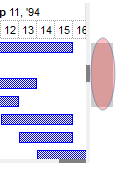
exVSThumb | 260
|
 align="top">
The thumb part (exThumbPart) in normal state. align="top">
The thumb part (exThumbPart) in normal state.
| |
| |
exVSThumbP | 261
|
The thumb part (exThumbPart) when it is pressed.
| |
| |
exVSThumbD | 262
|
The thumb part (exThumbPart) when it is disabled.
| |
| |
exVSThumbH | 263
|
The thumb part (exThumbPart) when cursor hovers it.
| |
| |
exVSDown | 264
|
 align="top">
The down button in normal state. align="top">
The down button in normal state.
| |
| |
exVSDownP | 265
|
The down button when it is pressed.
| |
| |
exVSDownD | 266
|
The down button when it is disabled.
| |
| |
exVSDownH | 267
|
The down button when the cursor hovers it.
| |
| |
exVSLower | 268
|
 align="top">
The lower part ( exLowerBackPart ) in normal state. align="top">
The lower part ( exLowerBackPart ) in normal state.
| |
| |
exVSLowerP | 269
|
The lower part ( exLowerBackPart ) when it is pressed.
| |
| |
exVSLowerD | 270
|
The lower part ( exLowerBackPart ) when it is disabled.
| |
| |
exVSLowerH | 271
|
The lower part ( exLowerBackPart ) when the cursor hovers it.
| |
| |
exVSUpper | 272
|
 align="top">
The upper part ( exUpperBackPart ) in normal state. align="top">
The upper part ( exUpperBackPart ) in normal state.
| |
| |
exVSUpperP | 273
|
The upper part ( exUpperBackPart ) when it is pressed.
| |
| |
exVSUpperD | 274
|
The upper part ( exUpperBackPart ) when it is disabled.
| |
| |
exVSUpperH | 275
|
The upper part ( exUpperBackPart ) when the cursor hovers it.
| |
| |
exVSBack | 276
|
 align="top">
The background part ( exLowerBackPart and exUpperBackPart ) in normal state. align="top">
The background part ( exLowerBackPart and exUpperBackPart ) in normal state.
| |
| |
exVSBackP | 277
|
The background part ( exLowerBackPart and exUpperBackPart ) when it is pressed.
| |
| |
exVSBackD | 278
|
The background part ( exLowerBackPart and exUpperBackPart ) when it is disabled.
| |
| |
exVSBackH | 279
|
The background part ( exLowerBackPart and exUpperBackPart ) when the cursor hovers it.
| |
| |
exHSLeft | 384
|
 The left button in normal state.
| |
| |
exHSLeftP | 385
|
The left button when it is pressed.
| |
| |
exHSLeftD | 386
|
The left button when it is disabled.
| |
| |
exHSLeftH | 387
|
The left button when the cursor hovers it.
| |
| |
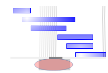
exHSThumb | 388
|
 The thumb part (exThumbPart) in normal state.
| |
| |
exHSThumbP | 389
|
The thumb part (exThumbPart) when it is pressed.
| |
| |
exHSThumbD | 390
|
The thumb part (exThumbPart) when it is disabled.
| |
| |
exHSThumbH | 391
|
The thumb part (exThumbPart) when the cursor hovers it.
| |
| |
exHSRight | 392
|
 The right button in normal state.
| |
| |
exHSRightP | 393
|
The right button when it is pressed.
| |
| |
exHSRightD | 394
|
The right button when it is disabled.
| |
| |
exHSRightH | 395
|
The right button when the cursor hovers it.
| |
| |
exHSLower | 396
|
 The lower part (exLowerBackPart) in normal state.
| |
| |
exHSLowerP | 397
|
The lower part (exLowerBackPart) when it is pressed.
| |
| |
exHSLowerD | 398
|
The lower part (exLowerBackPart) when it is disabled.
| |
| |
exHSLowerH | 399
|
The lower part (exLowerBackPart) when the cursor hovers it.
| |
| |
exHSUpper | 400
|
 The upper part (exUpperBackPart) in normal state.
| |
| |
exHSUpperP | 401
|
The upper part (exUpperBackPart) when it is pressed.
| |
| |
exHSUpperD | 402
|
The upper part (exUpperBackPart) when it is disabled.
| |
| |
exHSUpperH | 403
|
The upper part (exUpperBackPart) when the cursor hovers it.
| |
| |
exHSBack | 404
|
 The background part (exLowerBackPart and exUpperBackPart) in normal state.
| |
| |
exHSBackP | 405
|
The background part (exLowerBackPart and exUpperBackPart) when it is pressed.
| |
| |
exHSBackD | 406
|
The background part (exLowerBackPart and exUpperBackPart) when it is disabled.
| |
| |
exHSBackH | 407
|
The background part (exLowerBackPart and exUpperBackPart) when the cursor hovers it.
| |
| |
exSBtn | 324
|
 All button parts ( L1-L5, LButton, exThumbPart, RButton, R1-R6 ), in normal state.
| |
| |
exSBtnP | 325
|
All button parts ( L1-L5, LButton, exThumbPart, RButton, R1-R6 ), when it is pressed.
| |
| |
exSBtnD | 326
|
All button parts ( L1-L5, LButton, exThumbPart, RButton, R1-R6 ), when it is disabled.
| |
| |
exSBtnH | 327
|
All button parts ( L1-L5, LBUtton, exThumbPart, RButton, R1-R6 ), when the cursor hovers it .
| |
| |
exScrollHoverAll | 500
|
Enables or disables the hover-all feature. By default (Background(exScrollHoverAll) = 0), the left/top, right/bottom and thumb parts of the control' scrollbars are displayed in hover state while the cursor hovers any part of the scroll bar (hover-all feature). The hover-all feature is available on Windows 11 or greater, if only left/top, right/bottom, thumb, lower and upper-background parts of the scrollbar are visible, no custom visual-appearance is applied to any visible part. The hover-all feature is always on If Background(exScrollHoverAll) = -1. The Background(exScrollHoverAll) = 1 disables the hover-all feature.
| |
| |
exVSThumbExt | 503
|
The thumb-extension part in normal state. The ScrollPartVisible
property indicates whether the specified scroll part is visible or hidden. The
exExtentThumbPart part indicates the thumb-extension part..

| |
| |
exVSThumbExtP | 504
|
The thumb-extension part when it is pressed.
| |
| |
exVSThumbExtD | 505
|
The thumb-extension part when it is disabled.
| |
| |
exVSThumbExtH | 506
|
The thumb-extension when the cursor hovers it.
| |
| |
exHSThumbExt | 507
|
The thumb-extension in normal state.

| |
| |
exHSThumbExtP | 508
|
The thumb-extension when it is pressed.
| |
| |
exHSThumbExtD | 509
|
The thumb-extension when it is disabled.
| |
| |
exHSThumbExtH | 510
|
The thumb-extension when the cursor hovers it.
| |
| |
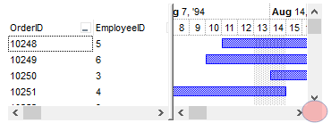
exScrollSizeGrip | 511
|
Specifies the visual appearance of the control's size grip when both scrollbars are shown.

| |


 >
>


 The left button in normal state.
 The thumb part (exThumbPart) in normal state.
 The right button in normal state.
 The lower part (exLowerBackPart) in normal state.
 The upper part (exUpperBackPart) in normal state.
 The background part (exLowerBackPart and exUpperBackPart) in normal state.
 All button parts ( L1-L5, LButton, exThumbPart, RButton, R1-R6 ), in normal state.
