|
359
|
Can I drag and drop the entire column to move the data instead of dragging the individual value point (for a single series)
*** MoveValue event - Notifies the application when a user performs a drag-and-drop operation to move a category, series, or data value. ***
LPARAMETERS nop
	with thisform.Graph1
		DEBUGOUT( .Series.Item(0).Data )
	endwith

with thisform.Graph1
	.BeginUpdate
	.AutoFit = .T.
	.AllowMoveValue = 1793 && 0x700 Or AllowKeysEnum.exLeftClick
	.ValuePoint = "1,transparent,transparent"
	.CategoryAxis.Categories = "Stanzen,Biegen,Beschichten,Vormontage"
	with .Series
		with .Add("1,2,3,4")
			.Color = "blue"
			.ShowValue = 257 && ShowValueEnum.exHitTestRect Or ShowValueEnum.exPoint
		endwith
	endwith
	.EndUpdate
endwith
|
|
358
|
Hide the value-points (method 2, no tooltip)
with thisform.Graph1
	.BeginUpdate
	.AutoFit = .T.
	with .CategoryAxis
		.Categories = "Germany,France,Japan,Canada,Australia,Mexico,"
		.MajorGridLines.Color = "lightgray"
	endwith
	with .Series.Add("1600,1450,1250,900,800,750")
		.ShowValue = 257 && ShowValueEnum.exHitTestRect Or ShowValueEnum.exPoint
	endwith
	.ValuePoint = "0"
	.EndUpdate
endwith
|
|
357
|
Hide the value-points (method 1)
with thisform.Graph1
	.BeginUpdate
	.AutoFit = .T.
	with .CategoryAxis
		.Categories = "Germany,France,Japan,Canada,Australia,Mexico,"
		.MajorGridLines.Color = "lightgray"
	endwith
	with .Series.Add("1600,1450,1250,900,800,750")
		.ShowValue = 257 && ShowValueEnum.exHitTestRect Or ShowValueEnum.exPoint
	endwith
	.ValuePoint = "1,transparent,transparent"
	.EndUpdate
endwith
|
|
356
|
Can the tooltip be displayed when the pointer hovers over the entire column, rather than only over the individual value-point
with thisform.Graph1
	.BeginUpdate
	.AutoFit = .T.
	with .CategoryAxis
		.Categories = "China,India,United States,Indonesia,Pakistan,Brazil,"
		.MajorGridLines.Color = "lightgray"
	endwith
	with .Series.Add("1410,1390,331,276,225,213")
		.ShowValue = 257 && ShowValueEnum.exHitTestRect Or ShowValueEnum.exPoint
	endwith
	.EndUpdate
endwith
|
|
355
|
Add markers to the graph by selecting specific points and attaching custom text annotations to them. These annotations are applied only to chosen points in the series, not to all points
with thisform.Graph1
	.BeginUpdate
	.AutoFit = .T.
	with .CategoryAxis
		.Categories = "China,India,United States,Indonesia,Pakistan,Brazil,"
		.MajorGridLines.Color = "lightgray"
	endwith
	with .Series.Add("1410,1390,331,276,225,213")
		.ShowValue = -1 && 0xfffffe78 Or ShowValueEnum.exHitTestRect Or ShowValueEnum.exHideIfEmpty Or ShowValueEnum.exValue Or ShowValueEnum.exLine Or ShowValueEnum.exPoint
		.ValueFormat = "index = 0 ? (category + `:` + value) : ``"
	endwith
	.EndUpdate
endwith
|
|
354
|
Can I move the data by drag and drop (single serie)
*** MoveValue event - Notifies the application when a user performs a drag-and-drop operation to move a category, series, or data value. ***
LPARAMETERS nop
	with thisform.Graph1
		DEBUGOUT( .Series.Item(0).Data )
	endwith

with thisform.Graph1
	.BeginUpdate
	.AutoFit = .T.
	.AllowMoveValue = 1793 && 0x700 Or AllowKeysEnum.exLeftClick
	.ValuePoint = "12,white,black"
	.CategoryAxis.Categories = "Stanzen,Biegen,Beschichten,Vormontage"
	with .Series
		.Def(10) = 1
		.Add("1,2,3,4").Color = "blue"
	endwith
	.EndUpdate
endwith
|
|
353
|
Can I move the data by drag and drop (multiple stacked-series)
*** MoveValue event - Notifies the application when a user performs a drag-and-drop operation to move a category, series, or data value. ***
LPARAMETERS nop
	with thisform.Graph1
		DEBUGOUT( .Series.ItemByPos(0).Data )
		DEBUGOUT( .Series.ItemByPos(1).Data )
	endwith

with thisform.Graph1
	.BeginUpdate
	.AutoFit = .T.
	.AllowMoveValue = 1793 && 0x700 Or AllowKeysEnum.exLeftClick
	.ValuePoint = "12,white,black"
	.CategoryAxis.Categories = "Stanzen,Biegen,Beschichten,Vormontage"
	with .Series
		.Def(12) = "A"
		.Def(10) = 1
		.Add("3").Color = 13210715
		.Add("5").Color = 3178478
		.Add("2").Color = 10987431
		.Add(",3").Color = 902143
		.Add(",2").Color = 13661253
		.Add(",,8").Color = 4631920
		.Add(",,3").Color = 9396258
		.Add(",,,4").Color = 870558
		.Add(",,,4").Color = 6513507
		.Add(",,,2").Color = 29592
	endwith
	.EndUpdate
endwith
|
|
352
|
Defines the default value assigned to a particular property when a new series is created
with thisform.Graph1
	.BeginUpdate
	.AutoFit = .T.
	.Legend.Visible = .T.
	.CategoryAxis.Categories = "Stanzen,Biegen,Beschichten,Vormontage"
	with .Series
		.Def(12) = "A"
		.Add("3").Color = "RGB(91,148,201)"
		.Add("5").Color = "RGB(238,127,48)"
		.Add("2").Color = "RGB(167,167,167)"
		.Add(",3").Color = "RGB(255,195,13)"
		.Add(",2").Color = "RGB(69,116,208)"
		.Add(",,8").Color = "RGB(112,173,70)"
		.Add(",,3").Color = "RGB(34,96,143)"
		.Add(",,,4").Color = "RGB(158,72,13)"
		.Add(",,,4").Color = "RGB(99,99,99)"
		.Add(",,,2").Color = "RGB(152,115,0)"
	endwith
	.EndUpdate
endwith
|
|
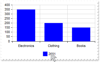
351
|
Is it possible to reorder just the series by drag and drop
with thisform.Graph1
	.BeginUpdate
	.AutoFit = .T.
	.AllowMoveValue = 769 && 0x300 Or AllowKeysEnum.exLeftClick
	.CategoryAxis.MajorGridLines.Color = "lightgray"
	with .Series
		with .Add("Electronics(350),Clothing(200),Books(150)",2001)
			.Stack = "A"
			.ShowValue = 1
		endwith
		with .Add("Electronics(500),Clothing(150),Books(180)",2002)
			.Stack = "A"
			.ShowValue = 1
		endwith
	endwith
	.ValuePoint = "16,white,black"
	.Legend.Visible = .T.
	.EndUpdate
endwith
|
|
350
|
Is it possible to reorder just the values/categories by drag and drop (method 2)
with thisform.Graph1
	.BeginUpdate
	.AutoFit = .T.
	.AllowMoveValue = 1
	.CategoryAxis.MajorGridLines.Color = "lightgray"
	with .Series
		with .Add("Electronics(350),Clothing(200),Books(150)",2001)
			.Stack = "A"
			.ShowValue = 1
		endwith
		with .Add("Electronics(500),Clothing(150),Books(180)",2002)
			.Stack = "A"
			.ShowValue = 1
		endwith
	endwith
	.ValuePoint = "16,white,black"
	.Legend.Visible = .T.
	.EndUpdate
endwith
|
|
349
|
Is it possible to reorder just the values/categories by drag and drop (method 1)
with thisform.Graph1
	.BeginUpdate
	.AutoFit = .T.
	.AllowMoveValue = 1
	.CategoryAxis.MajorGridLines.Color = "lightgray"
	with .Series
		with .Add("Electronics(350),Clothing(200),Books(150)",2001)
			.Stack = "A"
		endwith
		with .Add("Electronics(500),Clothing(150),Books(180)",2002)
			.Stack = "A"
			.ShowValue = 1
		endwith
	endwith
	.ValuePoint = "16,white,black"
	.Legend.Visible = .T.
	.EndUpdate
endwith
|
|
348
|
Is it possible to reorder the series and values/categories by drag and drop
with thisform.Graph1
	.BeginUpdate
	.AutoFit = .T.
	.AllowMoveValue = 513 && 0x200 Or AllowKeysEnum.exLeftClick
	.CategoryAxis.MajorGridLines.Color = "lightgray"
	with .Series
		with .Add("Electronics(350),Clothing(200),Books(150)",2001)
			.Stack = "A"
			.ShowValue = 1
		endwith
		with .Add("Electronics(500),Clothing(150),Books(180)",2002)
			.Stack = "A"
			.ShowValue = 1
		endwith
	endwith
	.ValuePoint = "16,white,black"
	.Legend.Visible = .T.
	.EndUpdate
endwith
|
|
347
|
Is it possible to reorder the values by drag and drop
with thisform.Graph1
.BeginUpdate
.AutoFit = .T.
.ValueAxis.Format = "value/100000"
var_s = "Tokyo(37833000), Delhi(30290000), Shanghai(27058000), S�o Paulo(22043000), Mumbai(20668000), Beijing(20384000), Karachi(20000000"
var_s = var_s + "), Dhaka(17072000), Istanbul(15029000), Los Angeles(13131000)"
with .Series.Add(var_s)
.ShowValue = 1
endwith
.ValuePoint = "12,white,black"
.AllowMoveValue = 1
.EndUpdate
endwith
|
|
346
|
Reorder multiple values
with thisform.Graph1
	.BeginUpdate
	.AutoFit = .T.
	.MultiColorSerie = .F.
	.Series.Add("1960(1.4),1980(11.2),2000(33.5),2010(65.8),2020(84.7)","GDP")
	.Order = ",4,,3"
	.EndUpdate
endwith
|
|
345
|
Move a value to an earlier or later position
with thisform.Graph1
	.BeginUpdate
	.AutoFit = .T.
	.MultiColorSerie = .F.
	.Series.Add("1960(1.4),1980(11.2),2000(33.5),2010(65.8),2020(84.7)","GDP")
	.Order = ",,3"
	.EndUpdate
endwith
|
|
344
|
Place one value at a specified position
with thisform.Graph1
	.BeginUpdate
	.AutoFit = .T.
	.MultiColorSerie = .F.
	.Series.Add("1960(1.4),1980(11.2),2000(33.5),2010(65.8),2020(84.7)","GDP")
	.Order = "3"
	.EndUpdate
endwith
|
|
343
|
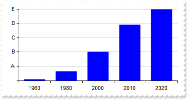
Configure the Y-axis so that it always displays exactly 5 labels (fixed-ticks), regardless of the data range
with thisform.Graph1
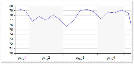
.BeginUpdate
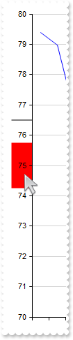
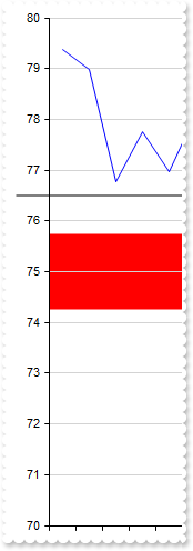
.AutoFit = .T.
.MultiColorSerie = .F.
with .ValueAxis
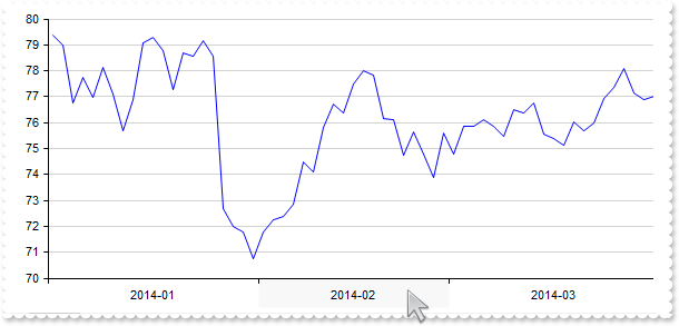
.AsPercent = .T.
.MajorUnit = 0.2
.Format = "value*5 array (``,`A`,`B`,`C`,`D`,`E`)"
endwith
.Series.Add("1960(1.4),1980(11.2),2000(33.5),2010(65.8),2020(84.7)","GDP")
.EndUpdate
endwith
|
|
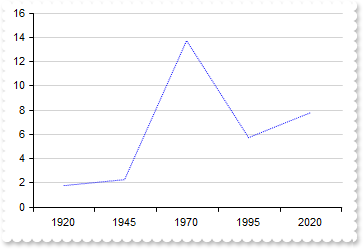
342
|
Define the style(solid, dash, dot, dash-dot, dash-dot-dot) of the line to show the serie
with thisform.Graph1
	.BeginUpdate
	.AutoFit = .T.
	with .Series.Add("1920(1.8),1945(2.3),1970(13.7),1995(5.7),2020(7.8)","Population")
		.Type = "Line"
		.Misc(8) = 2
	endwith
	.EndUpdate
endwith
|
|
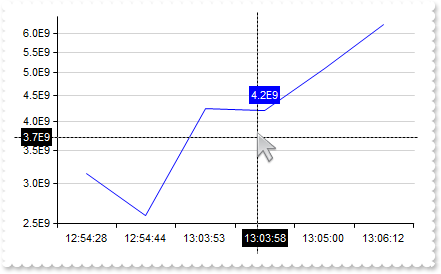
341
|
I'm using the logarithmic scale, but it's not displaying any values. How can I adjust the settings to show very small values
with thisform.Graph1
	.BeginUpdate
	sFormat = "(value and value < 1) ? (value format `%.1E` replace `-00` with ``) : (value format `0`)"
	.AutoFit = .T.
	.Object.Misc(32) = 0.000000001
	.MultiColorSerie = .F.
	.CategoryAxis.Format = "`<bgcolor white>` + value"
	with .ValueAxis
		.Type = 1
		.Format = sFormat
		.CursorFormat = sFormat
	endwith
	with .Series.Add("12:54:28(3.14E-09),12:54:44(2.59E-09),13:03:53(4.25E-09),13:03:58(4.20E-09),13:05:00(5.10E-09),13:06:12(6.25E-09)")
		.Type = "line"
		.CursorFormat = sFormat
	endwith
	.Cursor.Visible = .T.
	.EndUpdate
endwith
|
|
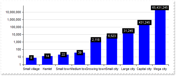
340
|
My data contains no values below 1. How can I prevent the logarithmic value axis from displaying the range between 0 and 1
with thisform.Graph1
	.BeginUpdate
	.AutoFit = .T.
	.MultiColorSerie = .F.
	.ValuePoint = ",,,,,,,black,transparent"
	.CategoryAxis.Format = "`<bgcolor white>` + value"
	with .ValueAxis
		.Type = 1
		.Min = 1
		.Format = "value format `0`"
	endwith
	var_s = "Small village(8),Hamlet(14),Small town(22),Medium town(39),Growing town(2118),Small city(6523),Large city(31245),Capital city(43"
	var_s = var_s + "1245),Mega city(65431245)"
	with .Series.Add(var_s)
		.ShowValue = 4
		.ValueFormat = "`<fgcolor white> ` + (value format `0`) + ` `"
	endwith
	.EndUpdate
endwith
|
|
339
|
Display logarithmic scale
with thisform.Graph1
	.BeginUpdate
	.AutoFit = .T.
	.MultiColorSerie = .F.
	.CategoryAxis.Format = "`<bgcolor white>` + value"
	with .ValueAxis
		.Type = 1
		.Format = "value format `0`"
	endwith
	var_s = "Sterile Water(0.0001),Treated Tap Water(0.001),Bottled Water(0.01),Clean Pond(0.1),River(1),Swamp(100),Sewage(10000),Wastewater "
	var_s = var_s + "Treatment Inlet(1000000)"
	.Series.Add(var_s).CursorFormat = "value < 1 ? value : (value format `0`) "
	.Cursor.Visible = .T.
	.EndUpdate
endwith
|
|
338
|
Can the values be shown in scientific notation (e.g., 1E+4, 5E-10) rather than full decimal form
with thisform.Graph1
.BeginUpdate
.AutoFit = .T.
.ValueAxis.Format = "value/100000"
var_s = "Tokyo(37833000), Delhi(30290000), Shanghai(27058000), S�o Paulo(22043000), Mumbai(20668000), Beijing(20384000), Karachi(20000000"
var_s = var_s + "), Dhaka(17072000), Istanbul(15029000), Los Angeles(13131000)"
with .Series.Add(var_s)
.ShowValue = -1 && 0xfffffe78 Or ShowValueEnum.exHitTestRect Or ShowValueEnum.exHideIfEmpty Or ShowValueEnum.exValue Or ShowValueEnum.exLine Or ShowValueEnum.exPoint
.ValueFormat = "value format `%.1E` replace `+00` with `+`"
endwith
.EndUpdate
endwith
|
|
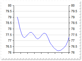
337
|
Highlight the value on both the chart and the axis
with thisform.Graph1
	.BeginUpdate
	.Import("C:\Program Files\Exontrol\ExGraph\Sample\Data/aapl.txt")
	.SerieType = "line"
	.Series.Add("open").Data = "AAPL (open)"
	.ValueAxis.Mark = "red[axis,chart](74.25-75.75),black[axis,chart](76.5)"
	.Refresh
	.EndUpdate
endwith
|
|
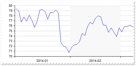
336
|
Highlight the categories on both the chart and the axis
with thisform.Graph1
	.BeginUpdate
	.Import("C:\Program Files\Exontrol\ExGraph\Sample\Data/aapl.txt")
	.SerieType = "line"
	.ValueSize = 6
	.Series.Add("open").Data = "AAPL (open)"
	with .CategoryAxes.Add("0")
		.Format = "value left 7"
		.Split = .T.
		.Mark = "#F8F8F8[axis,chart](label = `2014-02`)"
	endwith
	.Refresh
	.EndUpdate
endwith
|
|
335
|
Highlight values on axis only
with thisform.Graph1
	.BeginUpdate
	.Import("C:\Program Files\Exontrol\ExGraph\Sample\Data/aapl.txt")
	.SerieType = "line"
	.Series.Add("open").Data = "AAPL (open)"
	.ValueAxis.Mark = "red[axis](74.25-75.75),black[axis](76.5)"
	.Refresh
	.EndUpdate
endwith
|
|
334
|
Highlight the categories on axis only
with thisform.Graph1
	.BeginUpdate
	.Import("C:\Program Files\Exontrol\ExGraph\Sample\Data/aapl.txt")
	.SerieType = "line"
	.ValueSize = 6
	.Series.Add("open").Data = "AAPL (open)"
	with .CategoryAxes.Add("0")
		.Format = "value left 7"
		.Split = .T.
		.Mark = "#F8F8F8[axis](label = `2014-02`)"
	endwith
	.Refresh
	.EndUpdate
endwith
|
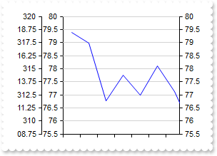
|
333
|
Highlight values
with thisform.Graph1
	.BeginUpdate
	.Import("C:\Program Files\Exontrol\ExGraph\Sample\Data/aapl.txt")
	.SerieType = "line"
	.Series.Add("open").Data = "AAPL (open)"
	.ValueAxis.Mark = "red(74.25-75.75),black[chart,axis](76.5)"
	.Refresh
	.EndUpdate
endwith
|
|
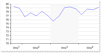
332
|
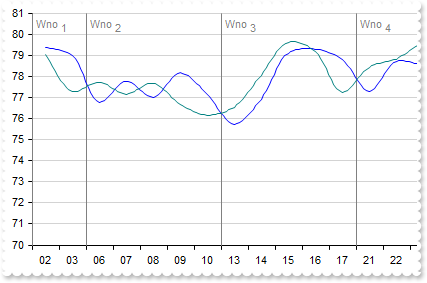
Highlight the categories using an expression
with thisform.Graph1
	.BeginUpdate
	.Import("C:\Program Files\Exontrol\ExGraph\Sample\Data/aapl.txt")
	.SerieType = "line"
	.Series.Add("open").Data = "AAPL (open)"
	with .CategoryAxes.Add("0")
		.Format = "`Wno<off-4>` + week(date(value left 10))"
		.Split = .T.
		.Mark = "#F8F8F8(index in (1,3))"
	endwith
	.Refresh
	.EndUpdate
endwith
|
|
331
|
Highlight the categories using an expression
with thisform.Graph1
	.BeginUpdate
	.Import("C:\Program Files\Exontrol\ExGraph\Sample\Data/aapl.txt")
	.SerieType = "line"
	.ValueSize = 6
	.Series.Add("open").Data = "AAPL (open)"
	with .CategoryAxes.Add("0")
		.Format = "value left 7"
		.Split = .T.
		.Mark = "#F8F8F8(label = `2014-02`)"
	endwith
	.Refresh
	.EndUpdate
endwith
|
|
330
|
Highlight the categories based on the index
with thisform.Graph1
	.BeginUpdate
	.Import("C:\Program Files\Exontrol\ExGraph\Sample\Data/aapl.txt")
	.SerieType = "line"
	.Series.Add("open").Data = "AAPL (open)"
	with .CategoryAxes.Add("0")
		.Format = "`Wno<off-4>` + week(date(value left 10))"
		.Split = .T.
		.Mark = "#F8F8F8(2)"
	endwith
	.Refresh
	.EndUpdate
endwith
|
|
329
|
IdemmM {string}, specifies the name of another value-axis to synchronize min, max, and major-unit values from when scrolling. If omitted or the value-axis with the given name is not found, these values are synchronized with the default value-axis
with thisform.Graph1
	.BeginUpdate
	.Import("C:\Program Files\Exontrol\ExGraph\Sample\Data/aapl.txt")
	with .Series.Add("open")
		.Data = "AAPL (open)"
		.Type = "line"
	endwith
	with .ValueAxes
		.Add("1st")
		with .Add("2nd")
			.Align = 2
			.IdemmM = "1st"
		endwith
		with .Add("3rd")
			.Format = "120 + value * 2.5"
			.MajorGridLines.Color = "transparent"
		endwith
	endwith
	.EndUpdate
endwith
|
|
328
|
Adds multiple value-axes
with thisform.Graph1
	.BeginUpdate
	.Import("C:\Program Files\Exontrol\ExGraph\Sample\Data/aapl.txt")
	with .Series.Add("open")
		.Data = "AAPL (close)"
		.Type = "line"
		.Style = 1
	endwith
	with .ValueAxes
		.Add("1st")
		.Add("2nd").Align = 2
	endwith
	.EndUpdate
endwith
|
|
327
|
Split the chart in weeks
with thisform.Graph1
	.BeginUpdate
	.ValueSize = 18
	.Import("C:\Program Files\Exontrol\ExGraph\Sample\Data/aapl.txt")
	with .Series.Add("open")
		.Data = "AAPL (open)"
		.Type = "line"
		.Style = 1
	endwith
	with .CategoryAxes.Add("0")
		.Format = "value mid 9 left 2"
		with .ChartGridLines
			.Format = "`<fgcolor gray>Wno <off 4>` + week(date(value left 10))"
			.Color = "gray"
			.Align = 0
		endwith
	endwith
	.EndUpdate
endwith
|
|
326
|
Resets the series, category axes and value axes without affecting the control's data
*** Click event - Occurs when the user presses and then releases the left mouse button over the control. ***
LPARAMETERS nop
	with thisform.Graph1
		.Reset()
	endwith

with thisform.Graph1
	.BeginUpdate
	.ValueSize = 18
	.Import("C:\Program Files\Exontrol\ExGraph\Sample\Data/aapl.txt")
	.SerieType = "line"
	with .Series.Add()
		.Name = "aapl"
		.Data = "AAPL (open),AAPL (high),AAPL (low),AAPL (close)"
	endwith
	with .CategoryAxes.Add("0")
		.Format = "value mid 9 left 2"
	endwith
	with .CategoryAxes.Add("0")
		.Format = "value left 7"
		.Split = .T.
	endwith
	.EndUpdate
endwith
|
|
325
|
Define the representation method for the data in all series where the type property is not specified, determining how these series are visually displayed
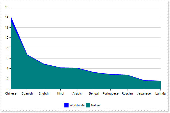
with thisform.Graph1
	.BeginUpdate
	.Pad = 18
	.AutoFit = .T.
	.SerieType = "rangeArea"
	with .Series
		var_s = "Chinese(14.1),Spanish(6.7),English(4.9),Hindi(4.2),Arabic(4.1),Bengali(3.3),Portuguese(2.9),Russian(2.8),Japanese(1.7),Lahnda(1."
		var_s = var_s + "6)"
		.Add(var_s,"Worldwide")
		var_s1 = "Chinese(13.2),Spanish(6.6),English(4.8),Hindi(4.1),Arabic(4.0),Bengali(3.2),Portuguese(2.8),Russian(2.7),Japanese(1.6),Lahnda(1."
		var_s1 = var_s1 + "5)"
		.Add(var_s1,"Native")
	endwith
	.Legend.Visible = .T.
	.EndUpdate
endwith
|
|
324
|
How can I prevent the labels from rotating around the chart when using the radarColumn type
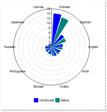
with thisform.Graph1
	.BeginUpdate
	.Pad = 18
	.AutoFit = .T.
	.SerieType = "radarCol"
	.Object.Misc(16) = .F.
	with .Series
		var_s = "Chinese(14.1),Spanish(6.7),English(4.9),Hindi(4.2),Arabic(4.1),Bengali(3.3),Portuguese(2.9),Russian(2.8),Japanese(1.7),Lahnda(1."
		var_s = var_s + "6)"
		.Add(var_s,"Worldwide")
		var_s1 = "Chinese(13.2),Spanish(6.6),English(4.8),Hindi(4.1),Arabic(4.0),Bengali(3.2),Portuguese(2.8),Russian(2.7),Japanese(1.6),Lahnda(1."
		var_s1 = var_s1 + "5)"
		.Add(var_s1,"Native")
	endwith
	.Legend.Visible = .T.
	.EndUpdate
endwith
|
|
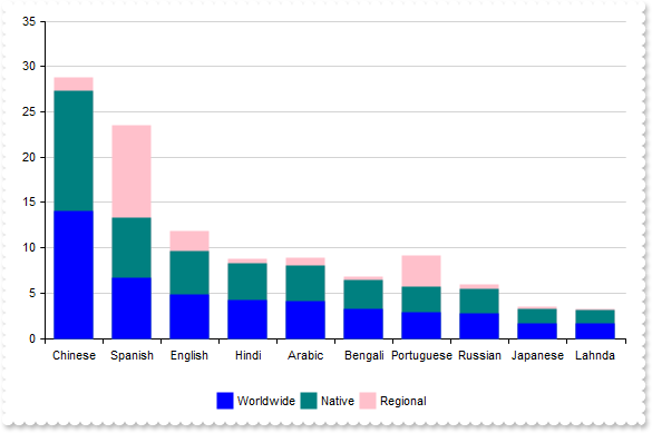
323
|
Disable stacking for all series at once
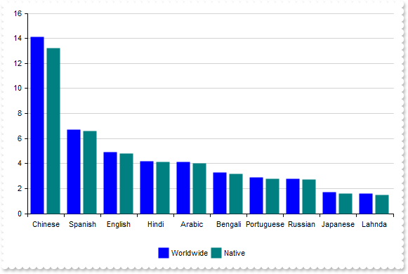
with thisform.Graph1
	.BeginUpdate
	.Pad = 18
	.AutoFit = .T.
	.AllowStack = .F.
	with .Series
		var_s = "Chinese(14.1),Spanish(6.7),English(4.9),Hindi(4.2),Arabic(4.1),Bengali(3.3),Portuguese(2.9),Russian(2.8),Japanese(1.7),Lahnda(1."
		var_s = var_s + "6)"
		.Add(var_s,"Worldwide").Stack = "group"
		var_s1 = "Chinese(13.2),Spanish(6.6),English(4.8),Hindi(4.1),Arabic(4.0),Bengali(3.2),Portuguese(2.8),Russian(2.7),Japanese(1.6),Lahnda(1."
		var_s1 = var_s1 + "5)"
		.Add(var_s1,"Native").Stack = "group"
	endwith
	.Legend.Visible = .T.
	.EndUpdate
endwith
|
|
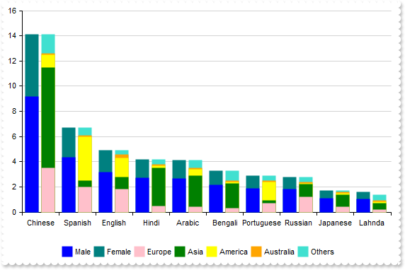
322
|
How can I stack more than three data series across multiple columns
with thisform.Graph1
	.BeginUpdate
	.Pad = 18
	.AutoFit = .T.
	with .Series
		var_s = "Chinese(9.165),Spanish(4.355),English(3.185),Hindi(2.73),Arabic(2.665),Bengali(2.145),Portuguese(1.885),Russian(1.82),Japanese(1"
		var_s = var_s + ".105),Lahnda(1.04)"
		.Add(var_s,"Male").Stack = "G1"
		var_s1 = "Chinese(4.935),Spanish(2.345),English(1.715),Hindi(1.47),Arabic(1.435),Bengali(1.155),Portuguese(1.015),Russian(0.98),Japanese(0"
		var_s1 = var_s1 + ".595),Lahnda(0.56)"
		.Add(var_s1,"Female").Stack = "G1"
		var_s2 = "Chinese(3.5),Spanish(2.0),English(1.8),Hindi(0.5),Arabic(0.4),Bengali(0.3),Portuguese(0.7),Russian(1.2),Japanese(0.4),Lahnda(0.2"
		var_s2 = var_s2 + ")"
		.Add(var_s2,"Europe").Stack = "G2"
		var_s3 = "Chinese(8.0),Spanish(0.5),English(1.0),Hindi(3.0),Arabic(2.5),Bengali(2.0),Portuguese(0.2),Russian(1.0),Japanese(1.0),Lahnda(0.5"
		var_s3 = var_s3 + ")"
		.Add(var_s3,"Asia").Stack = "G2"
		var_s4 = "Chinese(1.0),Spanish(3.5),English(1.5),Hindi(0.2),Arabic(0.5),Bengali(0.1),Portuguese(1.5),Russian(0.1),Japanese(0.1),Lahnda(0.1"
		var_s4 = var_s4 + ")"
		.Add(var_s4,"America").Stack = "G2"
		var_s5 = "Chinese(0.1),Spanish(0.1),English(0.3),Hindi(0.1),Arabic(0.1),Bengali(0.1),Portuguese(0.1),Russian(0.1),Japanese(0.1),Lahnda(0.1"
		var_s5 = var_s5 + ")"
		.Add(var_s5,"Australia").Stack = "G2"
		var_s6 = "Chinese(1.5),Spanish(0.6),English(0.3),Hindi(0.4),Arabic(0.6),Bengali(0.8),Portuguese(0.4),Russian(0.4),Japanese(0.1),Lahnda(0.5"
		var_s6 = var_s6 + ")"
		.Add(var_s6,"Others").Stack = "G2"
	endwith
	.Legend.Visible = .T.
	.EndUpdate
endwith
|
|
321
|
How can I stack data more than three series
with thisform.Graph1
	.BeginUpdate
	.Pad = 18
	.AutoFit = .T.
	with .Series
		var_s = "Chinese(14.1),Spanish(6.7),English(4.9),Hindi(4.2),Arabic(4.1),Bengali(3.3),Portuguese(2.9),Russian(2.8),Japanese(1.7),Lahnda(1."
		var_s = var_s + "6)"
		.Add(var_s,"Worldwide").Stack = "group"
		var_s1 = "Chinese(13.2),Spanish(6.6),English(4.8),Hindi(4.1),Arabic(4.0),Bengali(3.2),Portuguese(2.8),Russian(2.7),Japanese(1.6),Lahnda(1."
		var_s1 = var_s1 + "5)"
		.Add(var_s1,"Native").Stack = "group"
		var_s2 = "Chinese(1.5),Spanish(10.2),English(2.1),Hindi(0.5),Arabic(0.8),Bengali(0.3),Portuguese(3.5),Russian(0.4),Japanese(0.2),Lahnda(0."
		var_s2 = var_s2 + "1)"
		.Add(var_s2,"Regional").Stack = "group"
	endwith
	.Legend.Visible = .T.
	.EndUpdate
endwith
|
|
320
|
I use the legend, but clicking a series mostly rearranges them instead of hiding it
with thisform.Graph1
	.BeginUpdate
	.AutoFit = .T.
	.Object.Misc(17) = .F.
	.Series.Add("50,150,150,300","A1")
	.Series.Add("180,40,60,160","A2")
	.Legend.Visible = .T.
	.EndUpdate
endwith
|
|
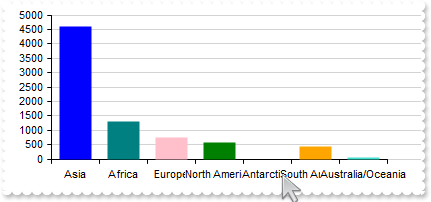
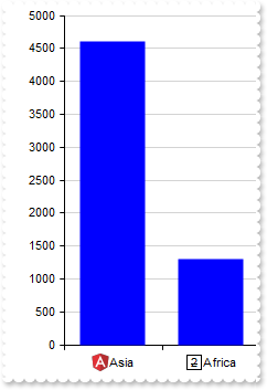
319
|
Adjusts the column/bar size so that the entire chart fits within the client rectangle
with thisform.Graph1
	.BeginUpdate
	.CategoryAxis.Categories = "Asia,Africa,Europe,North America,Antarctica,South America,Australia/Oceania"
	.Series.Add("4600,1300,747,579,0,422,42")
	.ValueAutoFit
	.EndUpdate
endwith
|
|
318
|
The categories overlap, making the text unreadable
with thisform.Graph1
	.BeginUpdate
	.ValueSize = 32
	with .CategoryAxis
		.Categories = "Asia,Africa,Europe,North America,Antarctica,South America,Australia/Oceania"
		.Format = "`<bgcolor white>` + value"
	endwith
	.Series.Add("4600,1300,747,579,0,422,42")
	.EndUpdate
endwith
|
|
317
|
Represents a single serie with single color (prevent multiple colors for single-serie)
with thisform.Graph1
	.BeginUpdate
	.AutoFit = .T.
	.MultiColorSerie = .F.
	.CategoryAxis.MajorGridLines.Color = "lightgray"
	.Series.Add("Electronics(350),Clothing(200),Books(150)",2001)
	.Legend.Visible = .T.
	.EndUpdate
endwith
|
|
316
|
How can I replace or add an icon at runtime
with thisform.Graph1
	.BeginUpdate
	var_s = "gAAAABgYACEHgUJFEEAAWhUJCEJEEJggEhMCYEXjUbjkJQECj8gj8hAEjkshYEpk8kf8ClsulsvAExmcvf83js5nU7nkCeEcn8boMaocXosCB9Hn09pkzcEuoL/fE+Ok"
	var_s = var_s + "YB0gB9YhIHrddgVcr9aktZADAD8+P8CgIA=="
	.ReplaceIcon(var_s)
	.ReplaceIcon("C:\images\favicon.ico",0)
	.AutoFit = .T.
	var_s1 = "<img>1</img>Asia(4600),<img>2</img>Africa(1300),<img>3</img>Europe(747),<img>4</img>North America(579),<img>5</img>South America"
	var_s1 = var_s1 + "(433),<img>6</img>Australia/Oceania(42)"
	.Series.Add(var_s1)
	.SeriesColors = "blue"
	.EndUpdate
endwith
|
|
315
|
No grid lines are shown even I set the Color and Format properties of ChartGridLines/OverviewGridLines
with thisform.Graph1
	.Series.Add("100,200,200,400","S1")
	.Series.Add("210,20,20,120","S2")
	with .CategoryAxes.Add("A,B,C,D","1st").ChartGridLines
		.Color = "red"
		.Format = "value"
	endwith
	.CategoryAxes.Add("E,F","2nd")
	.Refresh
endwith
|
|
314
|
Occasionally, the margins of the axes may not align perfectly with the view
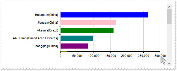
with thisform.Graph1
.BeginUpdate
.ValueSize = 18
.Pad = 24
.ValueAxis.Format = "value format `0`"
var_s = "Hulunbuir{China}(263068),Abu Dhabi{United Arab Emirates}(97200),Jiuquan{China}(167996),Altamira{Brazil}(159891),Bras�lia{Brazil}"
var_s = var_s + "(5784),Mumbai{India}(603.4),Delhi{India}(1484),Chongqing{China}(82400),Hulunbuir{China}(263068),Sao Paulo{Brazil}(1522),Linfen{C"
var_s = var_s + "hina}(20527),Santiago{Chile}(641),Mexico City{Mexico}(1485),Belo Horizonte{Brazil}(313),Hangzhou{China}(16817),Nairobi{Kenya}(69"
var_s = var_s + "6),Berlin{Germany}(891.68),Montreal{Canada}(431.5),Cordoba{Argentina}(576),Manaus{Brazil}(11401),Astana{Kazakhstan}(810),Goi�nia"
var_s = var_s + "{Brazil}(741),Cali{Colombia}(564),Sao Paulo{Brazil}(1522),Goiania{Brazil}(781)"
with .Series.Add(var_s)
.Type = "Col"
.Vertical = .T.
endwith
.Sort = "0:D"
.EndUpdate
endwith
|
|
313
|
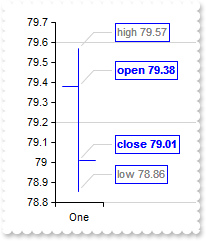
"candlestick" explained, an [open,high,low,close] chart
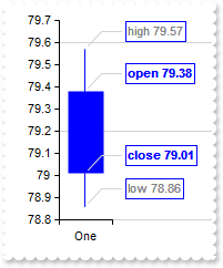
with thisform.Graph1
	.BeginUpdate
	.ValueSize = 32
	.ValuePoint = "0,,,,lightgray,1"
	.ValueAxis.MajorGridLines.Step = 4
	with .Series.Add("One(79.38 79.57 78.86 79.01)")
		.Type = "candlestick"
		.ShowValue = 7 && ShowValueEnum.exValue Or ShowValueEnum.exLine Or ShowValueEnum.exPoint
		.ValueFormat = "(inner array (`<b>open`,`<fgcolor gray>high`,`<fgcolor gray>low`,`<b>close`)) + ` ` + value"
	endwith
	.EndUpdate
endwith
|
|
312
|
"candlestick", a candlestick chart (also called Japanese candlestick chart or K-line) is a style of financial chart used to describe price movements of a security, derivative, or currency. While similar in appearance to a bar chart, each candleStick represents four important pieces of information for that day: open and close in the thick body, and high and low in the "candle wick". Being densely packed with information, it tends to represent trading patterns over short periods of time, often a few days or a few trading sessions. (data requires array of array of four-numbers, such as [[open, high, low and close]], supports vertical field, scrollable)
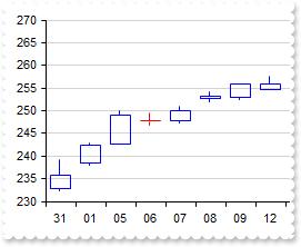
with thisform.Graph1
	.BeginUpdate
	.ValueSize = 18
	with .CategoryAxis
		.Categories = "Date"
		.Format = "value mid 9 left 2"
	endwith
	.Data = "C:\Program Files\Exontrol\ExGraph\Sample\Data/msft.csv"
	.Series.Add("Open,High,Low,Close","msft").Type = "candlestick"
	.EndUpdate
endwith
|
|
311
|
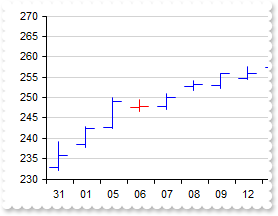
"ohlc" explained, an [open,high,low,close] chart
with thisform.Graph1
	.BeginUpdate
	.ValueSize = 32
	.ValuePoint = "0,,,,lightgray,1"
	.ValueAxis.MajorGridLines.Step = 4
	with .Series.Add("One(79.38 79.57 78.86 79.01)")
		.Type = "ohlc"
		.ShowValue = 7 && ShowValueEnum.exValue Or ShowValueEnum.exLine Or ShowValueEnum.exPoint
		.ValueFormat = "(inner array (`<b>open`,`<fgcolor gray>high`,`<fgcolor gray>low`,`<b>close`)) + ` ` + value"
	endwith
	.EndUpdate
endwith
|
|
310
|
"ohlc", an open-high-low-close chart (also OHLC) is a type of chart typically used to illustrate movements in the price of a financial instrument over time. Each vertical line on the chart shows the price range (the highest and lowest prices) over one unit of time, e.g., one day or one hour. Tick marks project from each side of the line indicating the opening price (e.g., for a daily bar chart this would be the starting price for that day) on the left, and the closing price for that time period on the right. The bars may be shown in different hues depending on whether prices rose or fell in that period. (data requires array of array of four-numbers, such as [[open, high, low and close]], supports vertical field, scrollable)
with thisform.Graph1
	.BeginUpdate
	.ValueSize = 18
	with .CategoryAxis
		.Categories = "Date"
		.Format = "value mid 9 left 2"
	endwith
	.Data = "C:\Program Files\Exontrol\ExGraph\Sample\Data/msft.csv"
	.Series.Add("Open,High,Low,Close","msft").Type = "ohlc"
	.EndUpdate
endwith
|
|
309
|
"bubble", a bubble chart or bubble plot is a type of chart that displays three dimensions of data (a bubble chart is an extension of the scatter plot used to look at relationships between three numeric variables.). Each entity with its triplet (v1, v2, v3) of associated data is plotted as a disk that expresses two of the vi values through the disk's xy location and the third through its size. Bubble charts can facilitate the understanding of social, economical, medical, and other scientific relationships. (data requires array of array of three-numbers, such as [[x, y, size]], supports vertical field, non-scrollable)
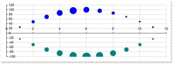
with thisform.Graph1
	.BeginUpdate
	.Pad = 18
	with .Series.Add("1 25 1,2 49 2,3 70 3,4 86 4,5 96 5,6 100 4,7 96 3,8 86 2,9 70 1,10 49 1,11 25 1","Bell<b>1")
		.Type = "bubble"
		.Misc(1) = 32
	endwith
	with .Series.Add("1 -25 1,2 -49 2,3 -70 3,4 -86 4,5 -96 5,6 -100 6,7 -96 5,8 -86 4,9 -70 3,10 -49 2,11 -25 1","Bell<b>2")
		.Type = "bubble"
		.Misc(1) = 32
	endwith
	.EndUpdate
endwith
|
|
308
|
"scatter", a scatter plot (also called a scatterplot, scatter graph, scatter chart, scattergram, or scatter diagram) is a type of plot or mathematical diagram using Cartesian coordinates to display values for typically two variables for a set of data. (data requires array of array of two-numbers, such as [[x, y]], supports vertical field, non-scrollable)
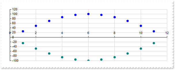
with thisform.Graph1
	.BeginUpdate
	.Pad = 18
	.Series.Add("1 25,2 49,3 70,4 86,5 96,6 100,7 96,8 86,9 70,10 49,11 25","Bell<b>1").Type = "scatter"
	.Series.Add("1 -25,2 -49,3 -70,4 -86,5 -96,6 -100,7 -96,8 -86,9 -70,10 -49,11 -25","Bell<b>2").Type = "scatter"
	.EndUpdate
endwith
|
|
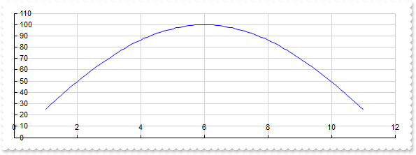
307
|
"scatterline", curved
with thisform.Graph1
	.BeginUpdate
	.Pad = 18
	with .Series.Add("1 25,2 49,3 70,4 86,5 96,6 100,7 96,8 86,9 70,10 49,11 25","Bell")
		.Type = "scatterline"
		.Style = 1
	endwith
	.EndUpdate
endwith
|
|
306
|
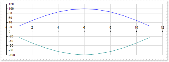
"scatterline", a scatter line chart is similar with "scatter" type, excepts that lines are shown between scatter plots. (data requires array of array of two-numbers, such as [[x, y]], supports vertical field, non-scrollable)
with thisform.Graph1
	.BeginUpdate
	.Pad = 18
	.Series.Add("1 25,2 49,3 70,4 86,5 96,6 100,7 96,8 86,9 70,10 49,11 25","Bell<b>1").Type = "scatterline"
	.Series.Add("1 -25,2 -49,3 -70,4 -86,5 -96,6 -100,7 -96,8 -86,9 -70,10 -49,11 -25","Bell<b>2").Type = "scatterline"
	.EndUpdate
endwith
|
|
305
|
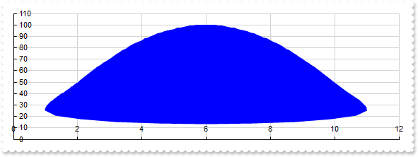
"scatterarea", curved
with thisform.Graph1
	.BeginUpdate
	.Pad = 18
	with .Series.Add("1 25,2 49,3 70,4 86,5 96,6 100,7 96,8 86,9 70,10 49,11 25","Bell")
		.Type = "scatterarea"
		.Style = 1
	endwith
	.EndUpdate
endwith
|
|
304
|
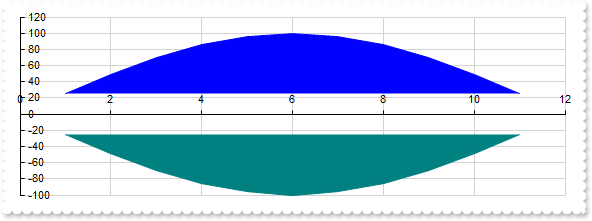
"scatterarea", a scatter area chart is similar with "scatterLine" type, excepts that scatter plots zone is filled. (data requires array of array of two-numbers, such as [[x, y]], supports vertical field, non-scrollable)
with thisform.Graph1
	.BeginUpdate
	.Pad = 18
	.Series.Add("1 25,2 49,3 70,4 86,5 96,6 100,7 96,8 86,9 70,10 49,11 25","Bell<b>1").Type = "scatterarea"
	.Series.Add("1 -25,2 -49,3 -70,4 -86,5 -96,6 -100,7 -96,8 -86,9 -70,10 -49,11 -25","Bell<b>2").Type = "scatterarea"
	.EndUpdate
endwith
|
|
303
|
"polarscatter", shows the serie as non-connected data points (data requires array of array of two-numbers, such as [[angle, value]], non-scrollable)
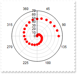
with thisform.Graph1
	.BeginUpdate
	.Object.Misc(16) = .F.
	with .CategoryAxis
		.Categories = "45,90,135,180,225,270,315,360"
		.MajorGridLines.Color = "lightgray"
	endwith
	var_s = "0 0,15 2,30 4,45 6,60 8,75 10,90 12,105 14,120 16,135 18,150 20,165 22,180 24,195 26,210 28,225 30,240 32,255 34,270 36,285 38,3"
	var_s = var_s + "00 40,315 42,330 44,345 46,360 48,15 50,30 52,45 54,60 56,75 58,90 60"
	with .Series.Add(var_s,"Spiral")
		.Type = "polarscatter"
		.Color = "red"
	endwith
	.EndUpdate
endwith
|
|
302
|
"polarline", represents data points connected with straight line segments (data requires array of array of two-numbers, such as [[angle, value]], non-scrollable)
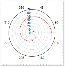
with thisform.Graph1
	.BeginUpdate
	.Object.Misc(16) = .F.
	with .CategoryAxis
		.Categories = "45,90,135,180,225,270,315,360"
		.MajorGridLines.Color = "lightgray"
	endwith
	var_s = "0 0,15 2,30 4,45 6,60 8,75 10,90 12,105 14,120 16,135 18,150 20,165 22,180 24,195 26,210 28,225 30,240 32,255 34,270 36,285 38,3"
	var_s = var_s + "00 40,315 42,330 44,345 46,360 48,15 50,30 52,45 54,60 56,75 58,90 60"
	with .Series.Add(var_s,"Spiral")
		.Type = "polarLine"
		.Color = "red"
	endwith
	.EndUpdate
endwith
|
|
301
|
"polararea", represents data points connected with straight line segments that enclose a filled area together with the chart pole (data requires array of array of two-numbers, such as [[angle, value]], non-scrollable)
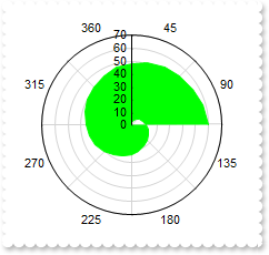
with thisform.Graph1
	.BeginUpdate
	.Object.Misc(16) = .F.
	with .CategoryAxis
		.Categories = "45,90,135,180,225,270,315,360"
		.MajorGridLines.Color = "lightgray"
	endwith
	var_s = "0 0,15 2,30 4,45 6,60 8,75 10,90 12,105 14,120 16,135 18,150 20,165 22,180 24,195 26,210 28,225 30,240 32,255 34,270 36,285 38,3"
	var_s = var_s + "00 40,315 42,330 44,345 46,360 48,15 50,30 52,45 54,60 56,75 58,90 60"
	with .Series.Add(var_s,"Spiral")
		.Type = "polarArea"
		.Color = "lime"
	endwith
	.EndUpdate
endwith
|