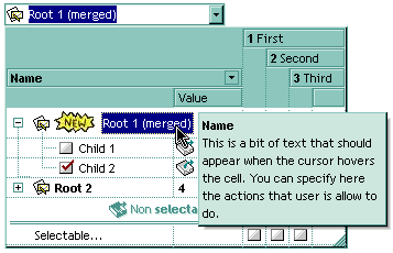
By default, the CellToolTip property is "..." (three dots). If the CellToolTip property is "..." the control displays the cell's caption if it doesn't fit the cell's client area. If the CellToolTip property is different than "...", the control shows a tooltip that displays the CellToolTip value. The control fires the ToolTip event when the column's tooltip is about to be displayed. Use the ToolTipWidth property to specify the width of the tooltip window. The ToolTipPopDelay property specifies the period in ms of time the ToolTip remains visible if the mouse pointer is stationary within a control. The ToolTipDelay property specifies the time in ms that passes before the ToolTip appears. The ToolTipFont property changes the font for the control's tooltip. Use the Background(exToolTipAppearance) property indicates the visual appearance of the borders of the tooltips. Use the Background(exToolTipBackColor) property indicates the tooltip's background color. Use the Background(exToolTipForeColor) property indicates the tooltip's foreground color. Use the ShowToolTip method to display a custom tooltip.
The tooltip supports the foolowing HTML tags:
- <b> bold </b> bolds a part of the caption.
- <u> underline </u> specifies that the portion should appear as underlined.
- <s>
strikeout</s> specifies that the portion should appear as strikeout. - <i> italic </i> specifies that the portion should appear as italic.
- <fgcolor=FF0000>fgcolor</fgcolor> changes the foreground color for a portion.
- <bgcolor=FF0000>bgcolor</bgcolor> changes the background color for a portion.
- <br> breaks a line.
- <solidline> draws a solid line. If has no effect for a single line caption.
- <dotline> draws a dotted line. If has no effect for a single line caption.
- <upline> draws the line to the top of the text line
- <r> aligns the rest of the text line to the right side. It has no effect if the caption contains a single line.
- <img>number[:width]</img> inserts an icon inside the cell's caption. The number indicates the index of the icon being inserted. The last 7 bits in the high significant byte of the number expression indicates the identifier of the skin being used to paint the object. Use the Add method to add new skins to the control. If you need to remove the skin appearance from a part of the control you need to reset the last 7 bits in the high significant byte of the color being applied to the part. The width is optional and indicates the width of the icon being inserted. Using the width option you can overwrite multiple icons getting a nice effect. By default, if the width field is missing, the width is 18 pixels.
- <img>key[:width]</img> inserts a custom size picture being loaded using the HTMLPicture property. The Key parameter indicates the key of the picture being displayed. The Width parameter indicates a custom size, if you require to stretch the picture, else the original size of the picture is used
- <font face;size>text </font> displays portions of text with a different font and/or different size. For instance, the <font Tahoma;12>bit</font> draws the bit text using the Tahoma font, on size 12 pt. If the name of the font is missing, and instead size is present, the current font is used with a different size. For instance, <font ;12>bit</font> displays the bit text using the current font, but with a different size.
- & glyph characters as & ( & ), < ( < ), > ( > ), &qout ( " ), &#number, For instance, the € displays the EUR character, in UNICODE configuration. The & ampersand is only recognized as markup when it is followed by a known letter or a # character and a digit. For instance if you want to display <b>bold</b> in HTML caption you can use <b>bold</b>

Note: The intersection of an item with a column defines a cell. Each cell is uniquely represented by its handle. The cell's handle is of HCELL type, that's equivalent with a long type. All properties of Items object that have two parameters Item and ColIndex, that refers a cell.

